
How shadcn/ui Works and When It Beats MUI or Chakra
shadcn/ui copies component source into your repo instead of installing a package. How it works now: Base UI, eight styles, theme tokens, Figma kits, vs MUI.
Updated 12 min read

shadcn/ui copies component source into your repo instead of installing a package. How it works now: Base UI, eight styles, theme tokens, Figma kits, vs MUI.
shadcn/ui is an open-source set of React components that a CLI copies into your codebase as editable source, instead of shipping them inside an npm package. It sits on headless primitives from Base UI, Radix or React Aria and styles them with Tailwind CSS. Its own docs put it bluntly: it is "how you build your component library."
That model explains much of its reach. The shadcn CLI pulls 7.4 million weekly downloads on npm as of November 2026. This year alone brought a new default primitive library, a third base, eight visual styles and an agent-focused toolkit.
This guide covers how the copy-in model works, how theming and styles fit together, what designers get in Figma, and when shadcn/ui beats a packaged library like MUI or Chakra UI.
button.tsx directly instead of overriding a package.-b radix, and React Aria became a third base the same month.primary and primary-foreground), while eight styles (Vega to Sera) change spacing, geometry and density.New UI kits, design system teardowns and component libraries land in the UI Things newsletter every week.
shadcn/ui is "a set of beautifully-designed, accessible components and a code distribution platform," according to its introduction page. The same page adds the line most people remember: "This is not a component library. It is how you build your component library."
A traditional library ships compiled components inside node_modules. When a button needs a different focus ring or an extra variant, you wrap it, override its styles or fork the package. With shadcn/ui, you get the component source instead, so the change happens in a file your team already reviews in pull requests.
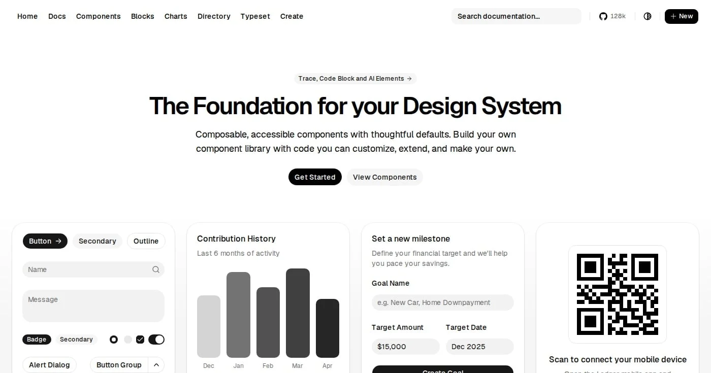
The project was created by the developer known as shadcn, who builds it at Vercel. It launched in January 2023 on top of Radix primitives, and the GitHub repository is MIT licensed.
The repository shows 128k stars in the site header as of November 2026. Stars do not measure installs, but they show how many developers follow the project.
Two shifts made shadcn/ui more relevant. The first is AI-assisted coding: the docs list "AI-Ready" as a core principle because open code is something a model can "read, understand, and improve." One r/reactjs developer notes that most AI tools produce React and shadcn components first, which helps explain why so many prototypes look alike.
The second is design systems moving into code. On r/UXDesign, designers ask how urgently they need to manage the design system directly in the codebase. For many teams, shadcn/ui is where that codebase starts.
The model has three layers: a CLI that copies files, primitives that handle behavior, and Tailwind classes that handle the look. Each layer is replaceable, which is the whole point.
You run one command and the component's TypeScript source lands in your project, usually under components/ui/. From then on, the markup, classes and variants are yours to edit.
pnpm dlx shadcn@latest init
pnpm dlx shadcn@latest add button card dialog
The CLI reference also covers view, search, apply, docs, info, build and migrate. The components.json file stores your setup, and the docs note it is only required when you use the CLI. Its style value cannot be changed after initialization, so choose deliberately.
Keyboard navigation, focus management and screen reader support come from a headless library that still installs from npm. Since July 2026, npx shadcn init picks Base UI by default. The team cited Base UI reaching version 1.6.0 and projects on shadcn/create choosing Base UI over Radix "2 to 1."
Radix was not deprecated. The changelog says every update and new component ships for both libraries, unless a component exists only in Base UI, and that working Radix apps do not need to migrate. React Aria joined as a first-class base on July 17, 2026.
pnpm dlx shadcn init -b radix
pnpm dlx shadcn@latest init --base aria
Tailwind CSS is a hard requirement. Each component is a set of utility classes plus variants, and since September 2026 every component imports a cn helper from its own cn package instead of a hand-written lib/utils.ts. Older projects can switch with shadcn migrate cn.
The Tailwind v4 update moved colors from HSL to OKLCH, removed forwardRef, and added a data-slot attribute to every primitive for styling. Existing Tailwind v3 and React 18 apps keep working.
npm update never touches copied files. When upstream fixes a bug, you decide whether to pull it in, and the fix can conflict with your own edits.
One r/reactjs commenter summed up the trade: "Shadcn is a starter kit for a design system that you maintain." (u/nayeem14 in r/reactjs, late 2025). Another in the same thread put it shorter: "I'm my own maintainer."
The installation docs recommend shadcn/create for new projects. You build a preset visually, preview it, and copy a setup command for your framework.
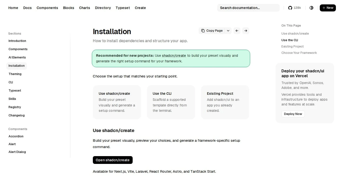
shadcn/create generates setups for Next.js, Vite, Laravel, React Router, Astro and TanStack Start. From the terminal, init -t scaffolds the next, vite, start, react-router and astro templates.
pnpm dlx shadcn@latest init -t nextLaravel is the exception: create the app with laravel new first, then run init. For an existing app, each framework guide has a manual section.
shadcn add installs single components. Blocks are larger compositions, such as dashboards, sign-in pages and sidebars, that copy several files at once.
Registries extend this beyond the official set. Any team can run its own registry for components, hooks, pages or config, and it works with any framework. Since August 2026, the CLI can also install from private GitHub repositories using your existing gh login.
The registry directory lists community registries built into the CLI, installed as npx shadcn add @<registry>/<component>. The docs warn that these are maintained by third parties, so review the code on install. Treat a registry item like a pull request from a stranger.
shadcn/ui separates three things that many libraries blur: color tokens, base colors and styles.
The theming docs recommend CSS variables, which is the default (tailwind.cssVariables: true). Tokens come in pairs: the base token sets the surface, and the -foreground token sets text and icons on that surface.
Token | Controls | Used by |
|---|---|---|
| Default app surface and text | Page shell, sections |
| High-emphasis actions | Default Button, active states |
| Subtle surfaces and helper text | Descriptions, placeholders |
| Hover, focus and selected surfaces | Ghost buttons, menu highlights |
| Destructive actions and errors | Delete buttons, invalid states |
| Borders, form controls, focus rings | Cards, inputs, focusable controls |
| Chart palette | Charts and dashboard blocks |
| Sidebar surfaces and states | The Sidebar component |
| Base corner radius | Cards, inputs, buttons, popovers |
shadcn/ui theme tokens and what they control
To add a token, define it under :root and .dark, then expose it to Tailwind with @theme inline:
:root {
  --warning: oklch(0.84 0.16 84);
  --warning-foreground: oklch(0.28 0.07 46);
}

@theme inline {
  --color-warning: var(--warning);
  --color-warning-foreground: var(--warning-foreground);
}
You can then use bg-warning and text-warning-foreground in any component.
One --radius value drives a whole scale. radius-lg equals the base, radius-sm is 0.6 times it, and radius-4xl is 2.6 times it, so changing one variable reshapes every corner.
The baseColor setting picks the neutral palette generated at init. The options are Neutral, Stone, Zinc, Mauve, Olive, Mist and Taupe.
A style rebuilds the same components with different padding, control heights, corners and density. The eight styles are Vega, Nova, Maia, Lyra, Mira, Luma, Rhea and Sera, and each works with Base UI, Radix and React Aria.
Two recent ones show the range. Sera (April 2026) is typography-first, with serif headings, square corners and underlined controls. Rhea (May 2026) is "a more compact Luma" for dense product UIs.
The team built Rhea as a new style because changing Tailwind's --spacing multiplier would change what p-2 means across your app.
In components.json, the library and style are stored together, such as base-nova. Presets bundle a style, base color, theme, fonts and icons into a short code you apply with shadcn apply.
The Figma page in the official docs opens with a caveat: "The Figma files are contributed by the community." There is no first-party kit, so the kit you pick decides how close design stays to code.
The docs list four free files. The oldest, Pietro Schirano's design system, shows 364k users on Figma Community, yet its comment thread includes "This is a kit, not a design system. No tokens" and "Needs variables."
Newer free options close that gap. The docs describe the shadcncraft Free Starter Kit as having native Figma variables for all eight styles, and Obra Studio's Community Edition as having an easy theming system.
Eight paid kits are listed, including shadcn/ui kit by Matt Wierzbicki, Obra shadcn/ui Pro, shadcn/studio and Shadcnblocks. Most add blocks, templates and design-to-code export.
Match three things before you commit. The kit should support your style (a Vega kit will mislead a Rhea codebase), map colors to variables that use the same token names as your CSS, and stay maintained as new components ship. For a broader list of starting points, see our roundup of free Figma UI kits.
The decision comes down to ownership: does your team want to maintain its component code, or install someone else's?
Library | How you get it | Styling | Price | Best for |
|---|---|---|---|---|
CLI copies source into your repo | Tailwind CSS, CSS variables, 8 styles | Free, MIT | Teams building their own design system | |
npm package | Material Design 2, theme object | Free core; MUI X from $299 per developer | Data-heavy apps that need advanced grids | |
npm package | Tokens and recipes | Free | Teams wanting a themeable package with tokens | |
npm package | Native CSS with a Styles API | Free | Apps that need 120+ components and 70+ hooks out of the box |
shadcn/ui compared with packaged React libraries
Pick shadcn/ui when your product needs a distinct look, when designers and developers share a token system, or when AI agents generate much of your UI. Copied code is easy for a model to read, and the shadcn skill feeds your components.json setup to tools like Claude Code.
It also wins when a library's gaps would force workarounds. One r/reactjs commenter at a MUI shop described wrapping a shadcn dropdown to get a nested menu MUI lacked, then accepting that bugs in that code were now theirs.
Pick MUI when you need advanced components such as Data Grid Pro, sold through MUI X licenses priced per developer (Pro $299, Premium $599, Enterprise $1,399). Pick Mantine when you want 120+ components and 70+ hooks maintained for you.
A packaged library also suits small teams without a designer, who benefit from someone else's defaults and release notes. If you already run a React kit like Untitled UI React, compare its component coverage before switching.
If your mental model is Radix plus Tailwind plus copy-paste, the changelog shows how much has been added since late 2025.
Date | Change |
|---|---|
December 2025 |
|
March 2026 | shadcn/cli v4 and the Luma style |
April to May 2026 | Sera and Rhea styles, presets, |
June 2026 | Chat components: MessageScroller, Message, Bubble, Attachment, Marker |
July 2026 | Base UI becomes the default, React Aria base, shadcn/typeset |
August 2026 | Private GitHub registries, Questionnaire component |
September 2026 |
|
October 2026 | Trace, Code Block and 21 AI Elements patterns |
On November 12, 2026, Vercel Labs released UI SDK, a TypeScript library of more than 50 UI behaviors such as roving focus, typeahead and popups. It is in beta and ships ready-made components for React, Vue, Svelte, Solid and Web Components.
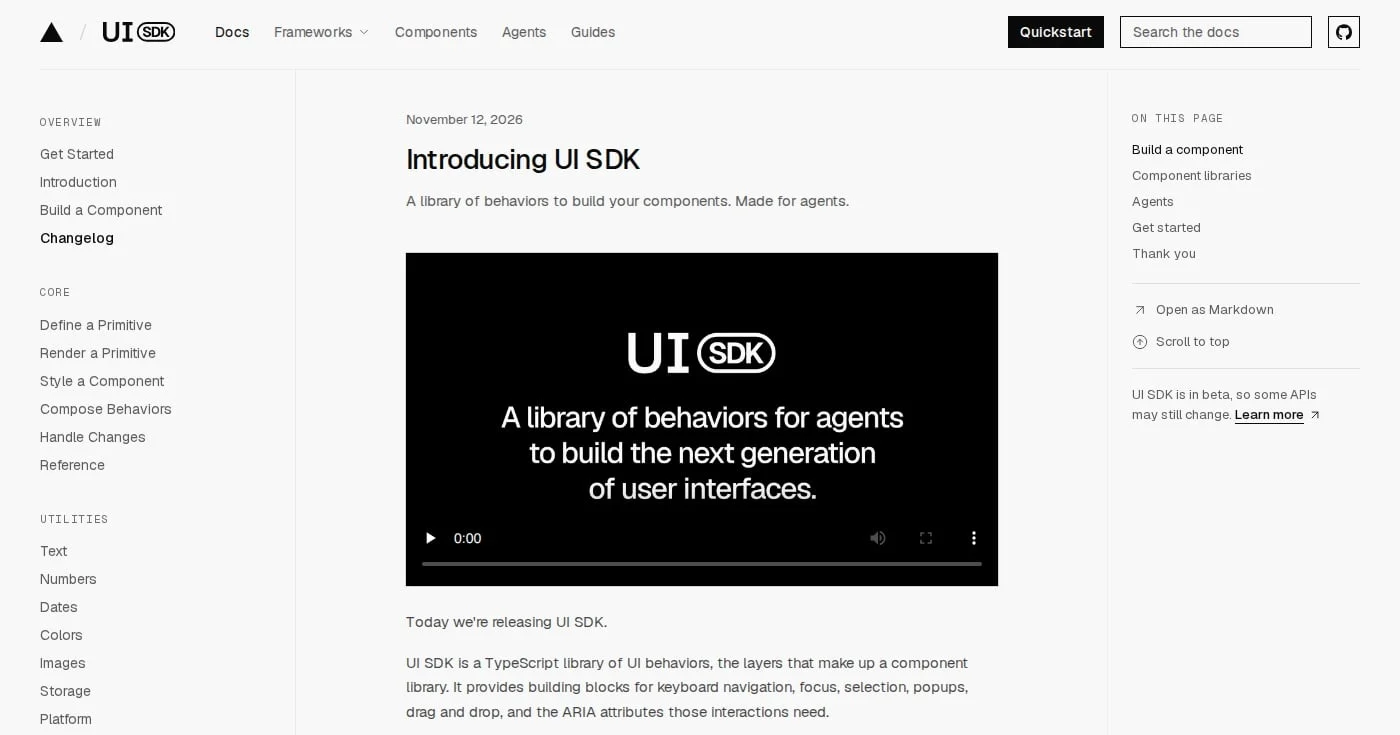
shadcn framed the release on X: "Agents are becoming both the builders and the users of interfaces. So we asked ourselves: where should the abstraction live?" (shadcn (@shadcn), November 2026). UI SDK sits a layer below shadcn/ui, in the behavior code that agents compose into components.
Untouched default settings are the look many people now call "AI-generated." As u/bogdanelcs put it in r/Frontend: "Vibe-coded frontends look AI because they use default everything" (June 2026). Pick a style, base color and fonts in shadcn/create before writing product code.
Teams that never read their components/ui/ folder miss upstream fixes and security reviews. Schedule a check of the changelog and use the CLI's migrate commands, such as migrate cn, instead of hand-patching dozens of files.
The Radix version of the Drawer is still built on Vaul, whose README says the repo is unmaintained. The Base UI Drawer replaced Vaul. Check which primitive each component depends on before you build on it.
The style field in components.json is fixed after init. Settle on Rhea, Sera or another style during setup, not three sprints in.
If your Figma kit calls a color brand/500 while your CSS calls it --primary, every handoff needs translation. Use the same semantic names (primary, muted, accent) in both places. Our guide to design systems covers token naming in more depth.
CopilotKit's open-source Shadify shows where the model leads. A LangChain agent composes shadcn components on the fly from a description, and the result can be exported as React code (CopilotKit on X, March 2026).
The move to Base UI followed the same ownership idea. Rather than swap libraries under existing apps, the team rebuilt every component for Base UI and let users choose. Usage then tipped toward Base UI before it became the default, so the default followed user behavior instead of forcing it.
For design engineers, the practical lesson is to treat shadcn/ui as a scaffold. Use it to get accessible behavior and a coherent token system on day one, then make the components yours. Our design engineering guide covers the role that usually owns this work.

Compare the 12 best AI avatar generators for 2026: HeyGen, Synthesia, D-ID, Colossyan, and 8 more ranked by use case, real free tier limits, and hidden costs.
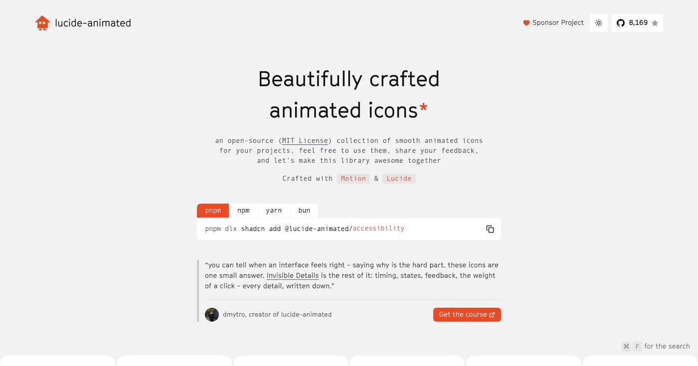
You can add motion to your interface for free with 10 open source animated icon libraries, led by lucide-animated at 8,170 GitHub stars and 350+ icons.

A Lottie animation is a JSON description of a vector timeline, usually exported from After Effects.

