Free Figma UI Kits: Top 10 Options for Designers in 2026
Discover the 10 best free Figma UI kits for 2026, from Untitled UI to Apple's iOS kit. Find the right design system to speed up your workflow.
Updated 14 min read
Discover the 10 best free Figma UI kits for 2026, from Untitled UI to Apple's iOS kit. Find the right design system to speed up your workflow.
Rebuilding the same buttons, inputs, and navigation bars from scratch on every project wastes hours you could spend on real design problems. The right free Figma UI kit eliminates that waste.
Figma's Community now offers 4,770+ free UI kits, covering everything from full enterprise design systems to focused landing page kits. With 13 million monthly active users on the platform as of March 2025, the quality of community-contributed resources has never been higher.
In this guide, you'll explore the top 10 free Figma UI kits available in 2026.
Not all free UI kits are worth your time. Here's what separates a useful kit from a frustrating one:
UI Kit | Best For | Key Features | Pricing | License | Platform |
|---|---|---|---|---|---|
Untitled UI | Web apps, SaaS | 900+ styles, Variables, WCAG | Free (Pro $129) | Free to use | Web |
Material 3 | Android design | Dynamic color, Theme Builder | Free | Apache 2.0 | Android |
iOS 18 Kit | iOS app design | Accurate iOS components, Apple-official | Free | Apple license | iOS |
shadcn/ui | React/Next.js teams | 1:1 code parity, Tailwind tokens | Free | MIT | Web |
Flowbite | Tailwind CSS | 1,000+ variants, dark mode | Free (Pro paid) | Free | Web |
Preline UI | Large-scale web | 36 categories, Tailwind CSS | Free | Free | Web |
Landify | Landing pages | 170+ blocks, 500+ components | Free (Pro $119) | Free | Web |
Ant Design | Enterprise apps | Enterprise UI patterns, React parity | Free | Free | Web |
Primer Web | Dev-led teams | GitHub-battle-tested, Octicons | Free | MIT | Web |
Detachless | Publishing sites | 80+ sections, 12 website types | Free | Free | Web |
Best for web apps and SaaS products
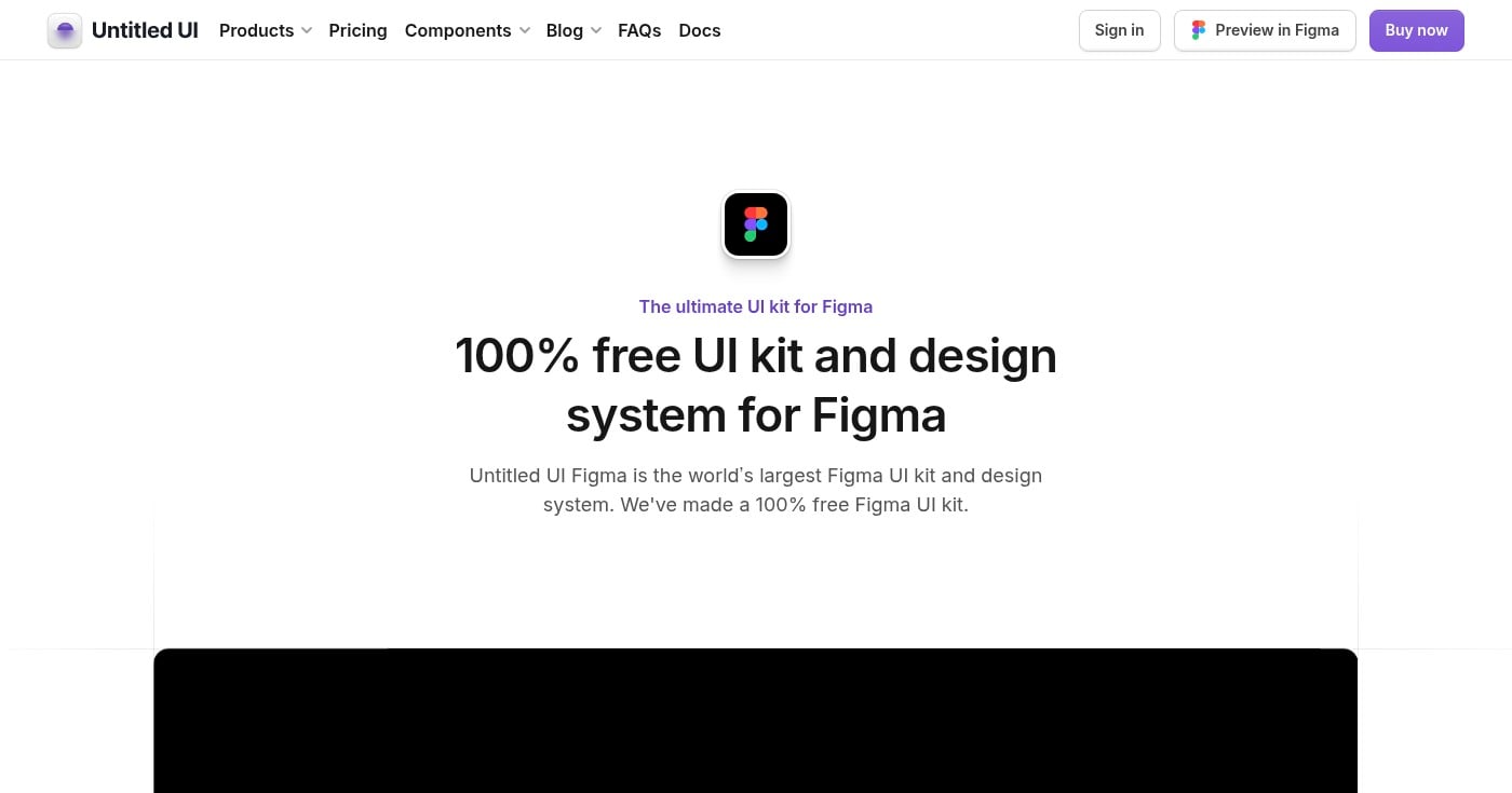
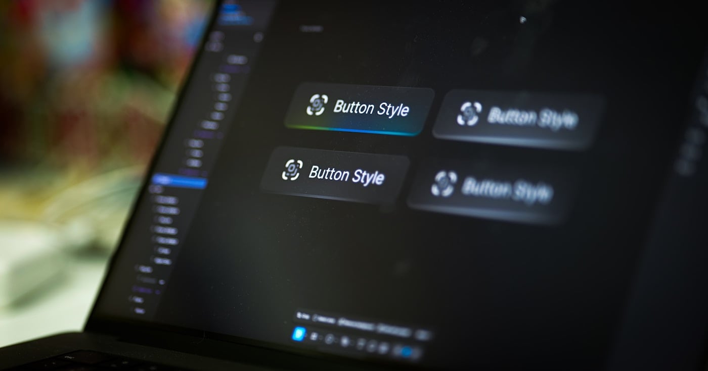
Untitled UI is the most popular Figma UI kit in the world, used by 320,000+ designers from top companies. The free version includes global styles, basic components, and page examples, giving you a professional foundation without the cost.
Every component is built with Auto Layout 5.0 and Figma Variables, with 900+ color, typography, and effects styles already configured. Light and dark themes are built directly into the variable system, so switching takes one click.
The free version is deliberately a slimmed-down edition of the paid kit. It gives you enough to start any web or SaaS project and evaluate whether upgrading to Pro (which adds 10,000+ components and 420+ page examples) makes sense for your workflow.
Free version is available for personal and commercial use.
Best for Android app designers
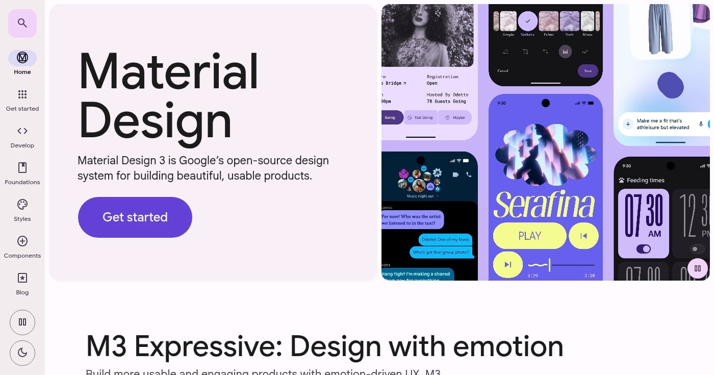
The Material 3 Design Kit is Google's official Figma resource for Material Design 3, with over 1 million users in the Figma Community. It's the authoritative starting point for any Android or cross-platform design.
The kit pairs with the Material Theme Builder plugin, letting you visualize dynamic color in your UI before a single line of code is written. The component library matches the Android code library directly, which keeps handoffs clean. Google updates it regularly. Version 1.24 (released March 2026) added expressive search layouts.
For designers building anything that runs on Android, this is the only kit you should start with. It eliminates guesswork about platform conventions and ensures your designs reflect actual system behavior.
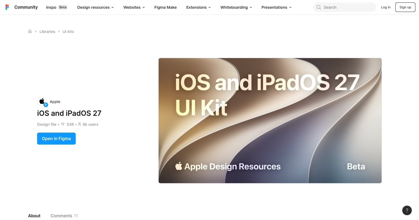
Best for iOS app designers
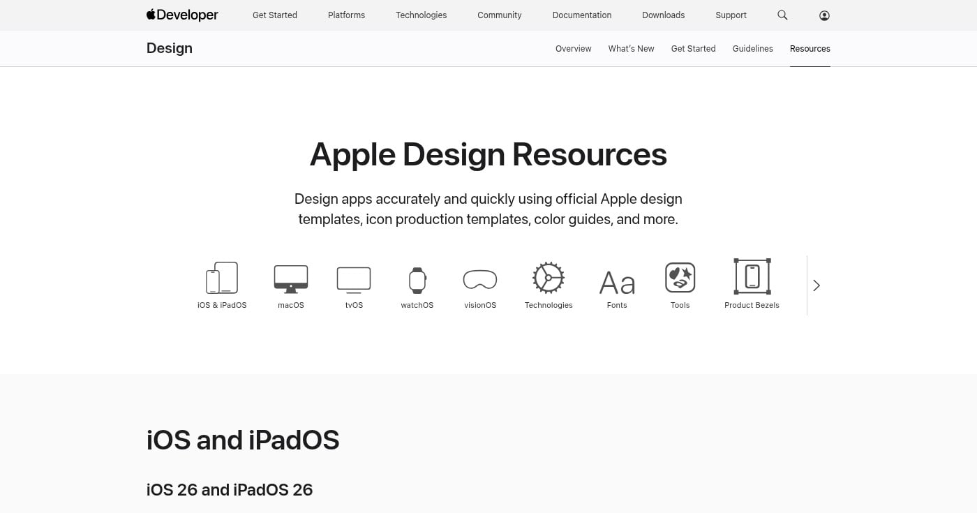
Apple's iOS 18 UI Kit is the official Figma resource for designing iPhone and iPad apps. With 228,000+ users on Figma Community, it's the standard reference for iOS designers worldwide. Apple also maintains a direct download through the developer portal.
The kit covers iOS system components with high accuracy: navigation bars, tab bars, alerts, sheets, pickers, and more. Updated March 2025 to reflect the latest iOS 18 UI changes, with an iOS 26 kit now available on Apple Developer Resources.
If you're designing apps for the App Store, starting with this kit means every component already matches what users expect from native iOS. That consistency reduces review cycles and makes developer handoff straightforward.
Best for React/Next.js teams
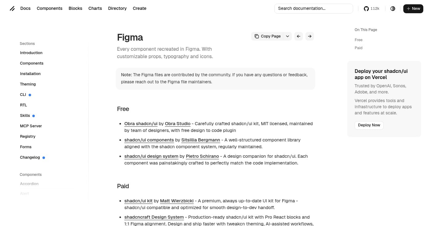
The shadcn/ui Design System for Figma has 329,000+ Figma Community users, making it one of the most-used free kits available. It maps directly to the shadcn/ui React component library, which is now a default choice for many Next.js projects.
Components in the Figma file correspond 1:1 to what developers import from shadcn/ui. Tailwind CSS token values are built directly into Figma Variables, so color and spacing decisions translate straight to code. The aesthetic is intentionally minimal, giving you a clean foundation to build a brand on rather than a finished look to fight against.
Multiple free community versions exist, including the MIT-licensed Obra shadcn/ui kit by Obra Studio. The shadcn/ui documentation page links all maintained versions directly.
Best for Tailwind CSS projects
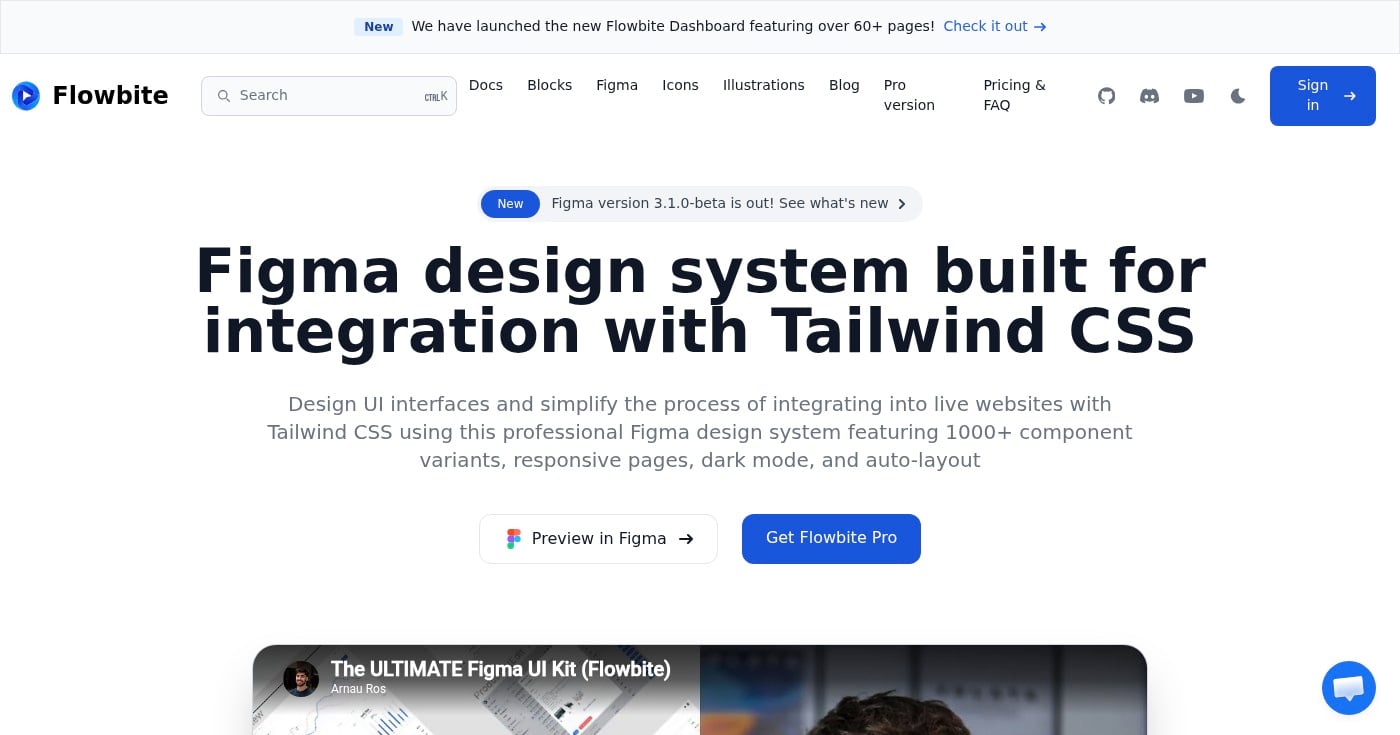
Flowbite is a Figma design system built specifically for Tailwind CSS. With 1,000+ component variants, responsive pages, and built-in dark mode, it gives Tailwind-based teams a shared visual language between design and development.
The system is actively maintained, with version 3.1.0-beta recently released. Every component is structured in Auto Layout and designed to translate directly to Tailwind utility classes, cutting the time between design approval and production code.
Eugene Fedorenko, Lead Designer at Wildbit, described the kit as providing a solid foundation for any project, with design tokens and components that map cleanly to Tailwind's framework.
Best for large-scale web design
Preline UI claims to be the world's largest free Figma design system, with 37,000+ downloads and a 5-star rating on Gumroad. The kit spans 36 component categories built around Tailwind CSS styles and Preline UI components.
The scope is notable: 1,700+ button variants, 220+ avatars, 130+ badge components, and a 12-column grid system with Auto Layout and constraints throughout. Variables cover colors, spacing, and border radius, letting you retheme the entire system with minimal effort. Multiple themes are included, with Harvest and Retro themes added in recent updates.
For designers working on complex web applications or documentation sites, Preline offers depth that most free kits can't match.
Best for landing pages and marketing websites
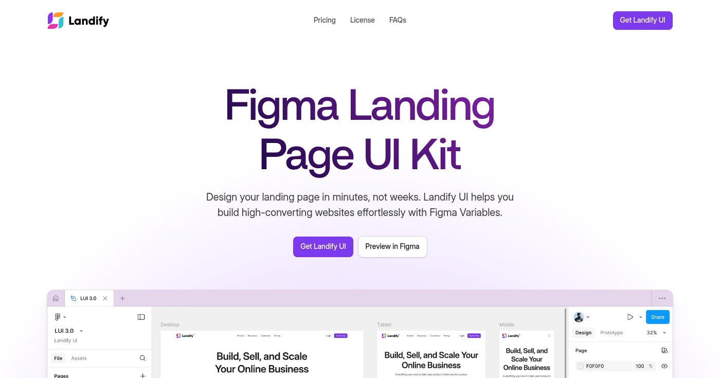
Landify is a focused landing page UI kit used by 196,000+ designers in the Figma Community. The free version includes 170+ blocks and 500+ components built around landing page patterns: hero sections, pricing tables, testimonials, CTAs, and more.
Components use Figma Variables for theme color and typography, and all sections are responsive with Auto Layout 5.0. Browser and phone mockups are included for showcasing web and mobile app designs in context.
The free version covers enough for most landing page projects. The paid full version (available at landify.design for $119) adds 350+ total sections if you need more range.
Best for enterprise application designers
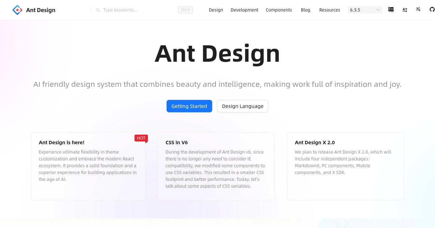
The Ant Design System for Figma (free version) has 159,000+ users on Figma Community. Based on Ant Design, the most widely used React UI library for enterprise software, it brings the same component structure and visual language into Figma.
The free version covers a comprehensive set of enterprise UI patterns: data tables, complex forms, navigation, modals, and status indicators. An open-source version is also available at Ant Design Open Source on Figma. Variables and Auto Layout are used throughout, keeping designs aligned with the React implementation.
If your team builds data-heavy dashboards or enterprise platforms with Ant Design in the codebase, this kit dramatically reduces design-development friction.
Best for developer-led design teams
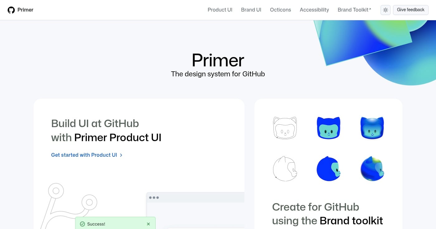
Primer is GitHub's open-source design system, and Primer Web brings it to Figma. This is the actual design system that powers GitHub's entire interface, making it one of the most battle-tested free kits available.
The Figma library includes web components used across GitHub: navigation, buttons, forms, labels, overlays, and more. Primer includes the Octicons icon library, GitHub's SVG icon set. Design tokens cover color, spacing, and typography with clear documentation on primer.style.
For developer-led teams that value rigorous documentation and open-source tooling, Primer provides a level of trust that community-contributed kits rarely match.
Best for publishing and blog websites
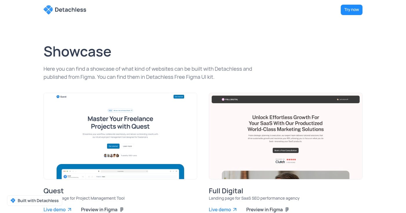
Detachless is a free Figma UI kit focused specifically on publishing and content websites. The kit includes 80+ section variations across 12 website section types, with 6 complete real-life website showcases to reference.
Built with Figma Variables and modern component structures, Detachless covers the patterns most relevant to editorial and content-heavy sites: headers, article layouts, author bios, newsletter signup sections, and footers. The 6 real-world website examples give you complete pages to reference rather than isolated components.
For freelancers designing blogs, media sites, or content platforms, this focused scope means less irrelevant noise than a general-purpose kit.
The best free Figma UI kits in 2026 are not stripped-down samples. They are production-quality starting points built with Variables, Auto Layout 5.0, and active maintenance.
Start with platform-specific kits (Apple, Google) if you're designing for mobile.
For web, Untitled UI's free version is the safest default, while developer-aligned teams benefit more from shadcn/ui or Flowbite.
Apple released the official iOS and iPadOS 27 UI kit for Figma on June 23, 2026. Here's what's inside, what changed from iOS 26, and how to get it free.
Get Apple's official iOS and iPadOS 27 UI Kit for Figma, featuring updated Liquid Glass components, templates, styles, and resources for realistic iPhone and iPad app designs.
Discover 23 specialist boutique mockup sites for branding design. Real photography, animated OOH, niche specialties, and pricing compared.