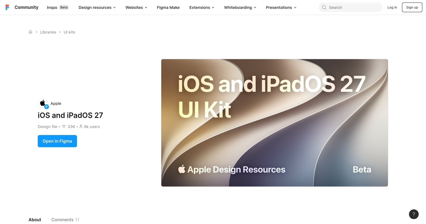
Apple released the official iOS and iPadOS 27 UI kit on June 23, 2026, published directly by Apple Design to the Figma Community. It's free, covers every native iOS and iPadOS component in light and dark mode, and replaces the iOS 26 kit that reached 244,000 users. Apple shipped a new file rather than updating iOS 26.
Get the setup checklist in Google Docs, one click to copy.
Key Takeaways
- The iOS and iPadOS 27 UI kit launched June 23, 2026 (free, official, published by Apple Design)
- Liquid Glass is now mandatory in Xcode 27 builds, making this kit the only accurate design reference for iOS 27 apps
- Apple shipped a new file rather than updating iOS 26 because structural changes would have broken existing designs
- SF Pro and the latest SF Symbols must be installed before you can edit components
Why This Kit Is Different from Every iOS Kit Before It
iOS 26 included a developer setting that let teams opt their apps out of Liquid Glass on native UI components. Starting with Xcode 27, that opt-out string is gone. Any app built with Xcode 27 using standard UIKit or SwiftUI components now renders Liquid Glass, regardless of what a developer does.
That change shifts the iOS 27 UI kit from a convenience to a requirement. If your app ships on iOS 27, this kit is the only way to see how your components will actually look in production before you build them.
Apple Design Evangelist Linda Dong announced the launch on X the morning of Figma Config 2026. Apple timed the Figma drop deliberately to coincide with Figma's annual conference. The kit reached 3,800 users in its first week.
What's Inside the iOS and iPadOS 27 UI Kit
The kit covers the full set of iOS and iPadOS system components across light and dark mode, including every system app icon and design templates for interface comps and user flows.
One underreported change: component names now match SwiftUI and UIKit class names. A designer naming a component "Tab Bar" in Figma maps directly to the same term a developer sees in Xcode. That alignment reduces handoff friction without extra tooling or translation.
The kit also ships a Liquid Glass slider variant in the Sliders component, reflecting the new system-level transparency control users get in iOS 27 settings.
Six Things That Changed from iOS 26
Apple shipped this as a new file, not an update. 'There were some structural changes that we would've broken people's designs,' Apple Designer Mike Stern explained. Teams with existing iOS 26 Figma files need to manually migrate components; no automatic upgrade path exists.
The six meaningful visual and structural changes:
- Liquid Glass borders. More defined borders replace drop shadows, improving legibility on plain white surfaces.
- Dark mode adjustments. Dark glass is lighter in dark mode. The selected tab bar item background is darker as a result.
- New transparency slider. iOS 27 adds a system-level opacity slider users control globally. All apps using native components are affected.
- Scroll edge effect. Default changed from iOS 26's soft gradient blur to a hard blur with a bottom border (similar to iOS 18). The
.soft option remains available. - Sidebar on iPhone. The sidebar component, previously iPad-only, now appears on iPhone in landscape mode.
- Button contrast fixes. Yellow and orange button tints from iOS 26 had poor contrast. iOS 27 corrects them.
Example: Setting Up the Kit for an iOS 27 App Redesign
Here's how to approach migrating an existing iOS 26 app to iOS 27.
Open both the iOS 26 and iOS 27 files side by side. Start with the Tab Bar component: the iOS 27 version introduces the Prominent tab role and revises dark mode behavior. Replace the iOS 26 Tab Bar instances with iOS 27 ones, then confirm SF Pro is installed so text layers render correctly.
Next, address Scroll Edge Effects. iOS 27's hard blur default differs visually from iOS 26's soft gradient. Swap the component, preview the result in Figma prototype mode, and note which screens need layout adjustments.
Color tokens are the last pass. If you've built custom color styles on iOS 26 values, remap those tokens to iOS 27's revised Liquid Glass material definitions before finalizing mockups.
How to Get the iOS 27 UI Kit for Figma
Before you open Figma:
- [ ] Download and install the latest SF Symbols (required for icon editing; Mac-only)
- [ ] Download and install SF Pro from Apple Design Resources (required for text component editing)
- [ ] Confirm you're on macOS (SF Symbols and icon layer editing require Mac)
In Figma:
- [ ] Open the iOS and iPadOS 27 UI kit on Figma Community
- [ ] Click "Open in Figma" and add it as a library to your team or org space (not just as a standalone file)
- [ ] Use the Assets panel search ("tab bar," "keyboard," "slider") to find components; navigating the nested tree is slower
For teams migrating from iOS 26:
- [ ] Open both files side by side and replace components manually
- [ ] Update your color tokens to match iOS 27's revised Liquid Glass material definitions
- [ ] Test Liquid Glass rendering on a real iOS 27 device; on r/FigmaDesign, designers confirm Figma's static rendering cannot reproduce the background distortion Apple's shader produces
As Nehmat Gereige, an AI-Design Professor, noted in her kit walkthrough: "This is a big missing piece that many people are not aware of because it's not directly in the documentation. So in order to edit any of the buttons, it's critical that you download SF Pro." The same prerequisite applies to iOS 27.
Get the full checklist in Google Docs.
Companion Resources
Apple released the following on June 23, 2026 alongside the iOS and iPadOS kit:
visionOS 27, watchOS 27, and tvOS 27 kits are not yet available as of June 27, 2026.