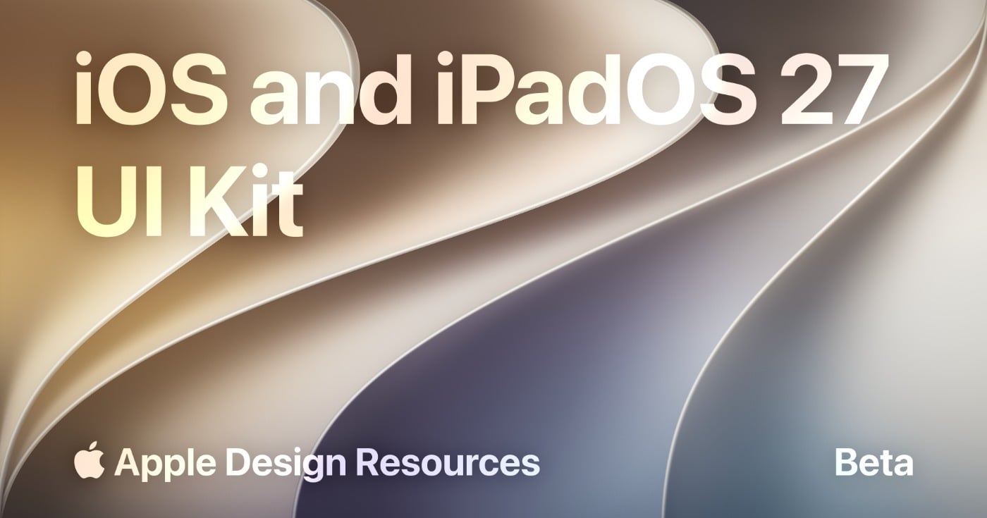
Apple's Official iOS and iPadOS 27 UI Kit for Figma
Get Apple's official iOS and iPadOS 27 UI Kit for Figma, featuring updated Liquid Glass components, templates, styles, and resources for realistic iPhone and iPad app designs.
Updated 2 min read
Get Apple's official iOS and iPadOS 27 UI Kit for Figma, featuring updated Liquid Glass components, templates, styles, and resources for realistic iPhone and iPad app designs.
Apple has published an official iOS 27 UI kit and iPadOS 27 UI kit for Figma as part of Apple Design Resources. Updated around June 23, 2026, it gives designers a current, accurate set of native iOS and iPadOS components to build iPhone and iPad mockups, flows, and interface concepts without rebuilding the basics by hand.
It's an official Apple Figma UI kit, released alongside Apple's iOS and iPadOS 27 design kits for Sketch. One thing worth being clear about: this is a design resource, not the UIKit development framework. It helps you design accurate screens in Figma — it doesn't ship code.
The kit covers the standard building blocks you'd expect from a first-party system:
It's been updated for iOS and iPadOS 27, most notably with Liquid Glass refinements. Apple also calls out expanded component and state support, naming changes that better align with code, and improved resizing — all of which make the Figma iOS components quicker to drop in and adjust.
Because it comes from Apple, the kit reflects current system behavior and the Liquid Glass design system rather than a third-party approximation. That means fewer guesses about spacing, states, and styling, and mockups that read as genuinely native.
The code-aligned naming and improved resizing also smooth out the path to handoff: components are easier to find, easier to adapt across screen sizes, and easier for developers to map back to the real system. For iPhone-and-iPad flows, having both platforms in one consistent kit saves a lot of cross-device setup.
Worth noting: a UI kit gets you accurate parts, but it isn't a substitute for Apple's Human Interface Guidelines. For production apps, follow the HIG for behavior, accessibility, and platform conventions.
The file is on Figma Community — open it, duplicate it to your drafts, and start designing.
Discover 23 specialist boutique mockup sites for branding design. Real photography, animated OOH, niche specialties, and pricing compared.
Compare 12 landing page builders by visitor caps, A/B testing, AI features, and conversion data. From Carrd's $9/year to Instapage's enterprise suite.
A head-to-head comparison of Figma and Paper (paper.design): pricing, AI workflows, MCP tools, developer handoff, and which wins for your team in 2026.