
Wireframe Fidelity: Stay Ugly, Skip, or Generate?
A wireframe is a skeletal screen layout for UI. Get lo-fi vs hi-fi, a skip-to-AI decision table, and how to sketch structure before you polish pixels.
Updated 15 min read
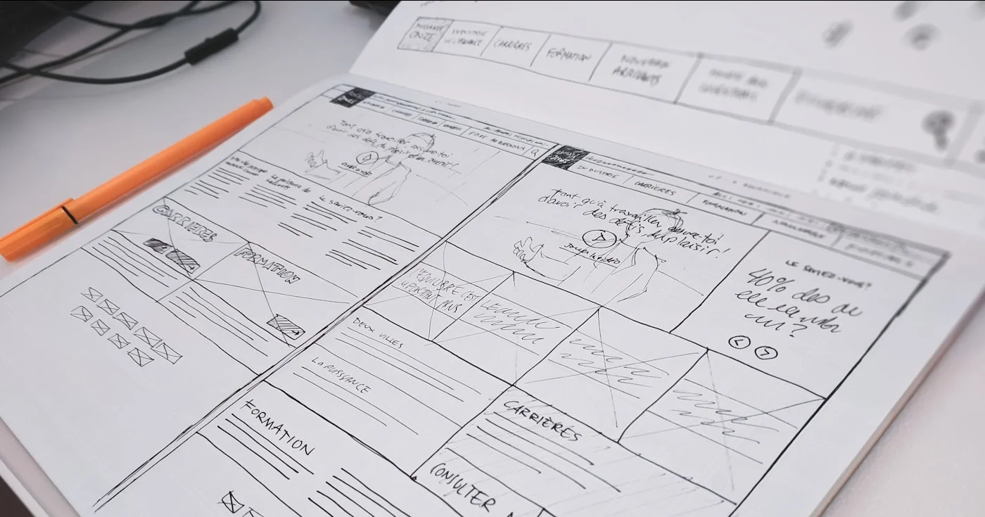

A wireframe is a skeletal screen layout for UI. Get lo-fi vs hi-fi, a skip-to-AI decision table, and how to sketch structure before you polish pixels.
A wireframe is a skeletal layout of a screen. Wikipedia calls it a page schematic or screen blueprint that shows what an interface does, and leaves visual design out. Yale's UX group keeps hierarchy, layout, functionality, and content placement, and drops color, imagery, fonts, and decoration.
This page is UI and UX layout, not 3D CAD, glasses, or the design agency named Wireframe.
Figma reports usage at 95% of Fortune 500 companies (March 2025). You still draw a wireframe when the open question is structure.
A wireframe is the cheapest honest picture of a screen's job. You place regions, name the primary action, and mark what is an image, a heading, or a control, without pretending the product is finished.
Nielsen Norman Group still treats messy drawing as expected. Thick lines stand in for headers; thinner lines stand in for body copy.
A rectangle with an X stands in for an image. The point of that ugliness is to keep the review on flow.
Leon Barnard (co-author of Wireframing for Everyone) put it on the NN/g podcast.
"Wireframes are really at the opposite end in terms of fidelity or level of realism. They're not intended to look or work like the final product. They're intended more for coming up with and exploring solutions."
Leon Barnard, NNgroup podcast (7:42)
Saptarshi Prakash, teaching beginner wireframes, draws the same line from the tool side.
"What makes a wireframe a wireframe isn't just the tool, it's the intent. It's about exploring the structure and logic and not the visuals."
Saptarshi Prakash, beginner wireframes (6:17)
On r/UXDesign, the recurring correction is about boxes versus prioritization.
"AI can generate layouts. It can't decide what problem you're solving. Wireframes aren't about boxes. They're about prioritization. What shows up first. What gets hidden. What the user is supposed to notice or ignore."
u/pedro_reyesh in r/UXDesign (Feb 2026)
A sitemap lists pages; a wireframe places content on one page. A user flow is the path between screens.
A clickable wireframe is already a prototype. Send that question to prototyping.
On 17 April 2026, Anthropic Labs shipped Claude Design. Later coverage in VentureBeat (17 June 2026) put first-week users above one million.
Prompt-to-layout got cheap. Agreement did not.
In April 2026, Balsamiq said the quiet part: polished screens in under 10 minutes, and teams still spending 2–3 weeks aligning on what to build. Vendor post, not a survey. The bottleneck it names matches what you see in reviews: generation without a shared skeleton just ships the wrong thing faster.
Sean Romer at Perficient (16 July 2026) asked the question juniors now ask out loud, then refused it.
"If AI can generate high-fidelity designs almost instantly, why bother with low-fidelity wireframes at all? It's a reasonable question. It's also the wrong one."
Sean Romer (Perficient, 16 Jul 2026)
Nielsen Norman Group framed the same shift in September 2026: value moves from how you build to what you choose to build.
Do not open Figma to "wireframe" a screen you cannot yet describe. The process is the same on paper and on a canvas: lock the decision, draw many small options, then promote one frame and annotate why it won.
Write the question the frame must answer. "What belongs above the fold on first visit?" is a wireframe question. "Does this blue pass contrast?" is not.
Perficient maps the activity to the question:
Activity | Primary question |
|---|---|
Discovery research | Are you solving the right problem? |
Competitive analysis | What expectations already exist? |
Low-fidelity wireframes | Is the IA and workflow correct? |
High-fidelity designs | Is visual communication clear? |
Interactive prototypes | Does the experience behave as intended? |
Usability testing | Can real users complete the goals? |
If the uncertainty is already gone, skip the activity. If it is not, no generator removes it by drawing faster.
NN/g's drawing conventions (20 June 2021) are still the fastest lo-fi method.
Put browser or device chrome down first (web at 1024×768 or 1920×1080). Place navigation and search next, then the largest regions before any control.
Use a thick pen and a small sheet so you cannot fuss pixels. Time-box the sheet. Paper still counts; paper sketches beat a Figma file that is secretly a mockup.
Photo-to-wire still ships in Uizard (Wireframe Scanner), plus a fidelity toggle (Wireframe Mode). Use that hop if the meeting is tomorrow and the thinking already happened on a whiteboard. Do not use it to skip the thinking.
Label what the region is for, not what it will look like. "Primary CTA: start trial" is an annotation. "Button, 16px, brand blue" is visual design leaking in.
For apps with few unique pages that change dynamically (mobile, checkout), NN/g's wireflows (2016) beat a stack of disconnected frames. You draw the states and the arrows on one sheet.
Barnard's pencil line is the practical test. If you are staring at a blank artboard, you are in the wireframe phase whether the file is named hi-fi or not.
"If you ever find yourself staring at a blank page or not really sure what to build, then that's where wireframing can really help you clarify your own ideas. [...] It's like picking up a pencil before a paintbrush."
Leon Barnard, NNgroup podcast (16:50)
People search "low-fidelity wireframe" far more than "high-fidelity wireframe." Keep the three rungs. Set the dial to the decision.
Thijs Verreck at Prototyper (23 July 2026) said the climb is tidy and mostly wrong. Fidelity is a dial. The right setting depends on the decision you are trying to make, not on how far along the project is.
Level | Looks like | Time (vendor claims) | Good for |
|---|---|---|---|
Low | Paper or grey boxes. Rectangle+X = image. | Miro: 15–30 min/screen | Structure, flow, what belongs here |
Mid | Real headlines, spacing, buttons. Often a wireflow. | Between lo-fi minutes and hi-fi hours | Multi-step maps before a prototype |
High | Greyscale almost-mockup. Real copy, honest grid. | Miro: 4–8 h/screen | Content-fit, stakeholder names, hierarchy honesty |
Miro's minutes are vendor economics, not a lab study. Use them as order-of-magnitude, not a quote for a statement of work.
NN/g work by Kara Pernice on lo-fi vs hi-fi prototypes (2016) is about prototypes, not wireframes. Fidelity can move independently in interactivity, visuals, and content.
Do not collapse that paper into a wireframe ladder. Map "what goes where / does it work / does it feel right," then leave behavior to prototyping.
Rule you can actually use: pick the lowest fidelity that can carry the decision. Lo-fi answers structure and flow. Hi-fi answers whether real content fits, whether hierarchy is honest at real proportions, and whether stakeholders will confuse this with a finished UI.
Low fidelity is paper, a whiteboard, or a digital file that still looks unfinished on purpose. Balsamiq exists so the unfinished look is the point. The company reports 16,000+ teams a month, 1.4 million purchases, and 204 countries, bootstrapped in Bologna since 2008.
On r/UI_Design, the complaint is vocabulary: a "wireframe" now means an uncolored first-draft UI. When the goal is staying ugly, Reddit still points at paper, Balsamiq, Excalidraw, Whimsical, or Miro.
Low fidelity fails when the reviewer cannot picture the product. Raise fidelity for those rooms. Do not raise it for yourself as a comfort habit.
Spacing gets honest here, and labels become real words. You still withhold color and photography.
Add the arrows when sequence is the fight: a wireflow of checkout, settings, or empty-to-populated states.
This is the rung to use when the fight is sequence, not chrome. If five stakeholders disagree on what is "above the fold," mid-fi with real headlines beats another hour of grey boxes.
Real product names, real line lengths, and a grid you could hand to visual design: that is high fidelity. It is useful. It is also the rung that stops being a wireframe.
Claritee's scene (9 January 2026) is the review-room test:
"Show someone a wireframe and they’ll talk about structure, flow, and content. Show them a high-fidelity mockup and they’ll talk about colors, fonts, and whether they like the stock photo."
Claritee (Jan 2026)
If your "hi-fi wireframe" already triggers font debate, you have a mockup. Call it that. NN/g paper prototyping still exists for a reason: early structure changes stay cheap while the drawing still looks disposable.
High-fidelity is a choice for content-fit and named-product reviews.
Use the table, not a manifesto. Skip when the uncertainty this activity would reduce is already gone.
If this is true | Do this |
|---|---|
New information architecture, disputed priorities, or a content-first page | Stay lo-fi. The frame is how you argue. |
Mature product, known workflow, proven components, design system in place | Skip to hi-fi. Boxes will not teach you anything new. |
You will treat generated UI as a disposable skeleton, not a mockup | Skip to generation. Keep the wireframe job. |
Structural uncertainty is high and many stakeholders disagree | Do not skip. You need a shared ugly picture. |
A minority on Reddit already skip the boxes and keep the job.
"I stopped drawing wireframes in favor of vibe coded prototypes. The speed I can produce a stateful prototype using v0, Figma Make, or Cursor in the same time it used to take me to build wires. The key is to treat the vibe-coded designs like they're wires and not high-fi mockups."
u/Ruskerdoo in r/UXDesign (Feb 2026)
That path still presents generated chrome as a wire, not as signed-off UI. Barnard's warning still applies to a pretty prototype you secretly want rubber-stamped.
"Sometimes if you have a really polished prototype that you spend a lot of time on, you secretly just want them to sign off on it so you can ship it, and sometimes it's too late in the process."
Leon Barnard, NNgroup podcast (27:11)
Keep the thinking even if your team has burned the word wireframe. Rename the artifact if you must. Do not drop the questions lo-fi was meant to answer.
These three words get used as synonyms in the same meeting. Split them by the question each artifact can answer.
Artifact | Fidelity | Answers | Interactivity |
|---|---|---|---|
Wireframe | Low (greyscale, placeholders) | What goes where | None / static |
Mockup | Medium–high visual | What it looks like | None / static |
Prototype | Low–high | Does it work | Clickable / functional |
A static hi-fi frame with real type is a mockup, even if the filename says wireframe. A clickable grey flow is a prototype, even if nobody colored it.
Depth on behavior, motion, and testing lives in prototyping.
NN/g is the reminder that a prototype can be lo-fi. Do not wait for polish to learn whether the flow works.
Claude Design is a shipped Anthropic Labs product (research preview for Pro, Max, Team, and Enterprise). The first-party use case is a product manager sketching feature flows and handing them to Claude Code.
A 30 April 2026 write-up at designproject.io says Claude Design wins in the phase before hi-fi. It does not replace Figma auto-layout, redlines, or multi-file libraries. The output is meant to be rough.
Use generation for concept exploration. Which generator to pick is already covered in AI generators. AI for designers is the workflow view.
A prompt-to-interactive hop sits in the same workspace via Figma Make. As of 9 July 2026 the Make model is GPT-5.6. Use Make when you already know the pattern and you want state, not when you still need to argue the IA.
Balsamiq added optional AI prototyping and MCP on 19 March 2026. Structure-first software grew a hop to interactive. It did not become a Figma rival.
"AI can generate 50 screens from a one-line prompt. But it can't tell you which one your team will actually build toward."
Balsamiq on LinkedIn (April 2026)
Balsamiq also posted the pairing rule: vibe-coding is fine if you are vibe-thinking too.
On X, named method accounts went quiet. The feed is skip-to-Claude-Code, Figma Make, and vibe-coding. Luke Wroblewski's May 2026 line is the one that still describes the job.
“For my part, I've always held the most important role of designers is fighting for the coherency, simplicity, and visual communication needed to humanize technology in a way that makes it work for people, not the other way around. New tools don't change this. New ways of working
New tools do not retire coherency, simplicity, or visual communication. A May 2026 spec essay describes a developer skip path.
A spec does not place the heading. Someone still has to decide what the screen does.
Google Stitch and other prompt-to-UI surfaces belong in that generator conversation, not in this definition.
Unranked canvases. Pick the one that keeps you ugly enough for the decision you are making. For kits and generators, leave this page: AI generators and Adobe XD kits.
Paper or a whiteboard. Fastest lo-fi. NN/g still teaches it. No account required.
Figma. Default digital canvas for product teams, plus Make when you want a generated hop in the same file. Founded 2012. Shares began trading as NYSE:FIG on 31 July 2025.
Balsamiq. Classic lo-fi, bootstrapped since 2008. Stay ugly on purpose; optional AI prototyping is a hop, not a reason to polish.
Wireframe.cc. Limited palette on purpose. Free tier is a public single page; use it when Figma's components will tempt you.
**Uizard and Claude Design.** Scanner, fidelity toggle, or PM-to-code sketching. Generation sits here as a canvas, not as a ranking.
Reddit's fast set still includes Excalidraw, Whimsical, and Miro. If Figma's library is the thing slowing you down, that complaint is the requirement: switch canvas, do not "lo-fi" inside a component system.
Two or three annotated frames teach hierarchy. A 20-example gallery does not.
Draw the browser chrome. Put a short nav (4–6 items) and a search field if search is a real job. Write a real headline, not lorem: the actual promise of the page, at the length it will ship.
One primary CTA above the fold. One secondary action at most. A social-proof strip as a single rectangle, not five logo SVGs.
Three feature blocks as equal boxes; if they are not equal in the product, do not draw them equal. Footer as a thin band.
Annotate: "User's first job is X. Everything else waits." If marketing then asks for a video background, you have evidence the request fights the job.
The first pass is a choice: left nav or top nav, never both. Page title as a real product name. Filters as a single row of controls, labeled with the actual dimensions (date, plan, workspace).
Four KPI tiles as rectangles with a number-sized label and a unit. If you cannot name the four metrics, you are not ready to draw.
A table or empty state owns the rest of the page. Do not add a chart "for visual interest."
Annotate: "What is the one decision this screen supports this morning?" Kill tiles that do not feed that decision.
Thumb reach decides this frame. Status bar and a tab bar with 3–5 destinations. Title of the current tab.
A list of rows with a leading icon box, a primary line, and a secondary line. A floating action button only if that action is the product's main create.
Put the primary action in the bottom third for thumb reach. Keep destructive actions out of the thumb's rest position.
Write empty-state copy in real words ("No invoices yet. Create the first one.").
Annotate the back stack. If a row opens a screen that opens a screen, draw the wireflow, not three pretty rectangles.
Stakeholders now say "wireframe" and mean a first-draft UI with the color turned down. You then spend throwaway polish while the meeting locks onto type.
If the review is about fonts, you left the wireframe phase. Drop fidelity or rename the file to mockup.
Templates repeat. Draw one settings frame and list the siblings.
Wireflows cover dynamic states of the same page. A 40-frame deck of near-duplicates is how lo-fi becomes a second visual-design pass.
Faster pixels do not tell you whether the IA is right. If you skip, skip because the uncertainty is gone, or because you will treat the generated output as a wire.
Figma is the wrong canvas when Auto Layout and variants are the tax you came to avoid. The lo-fi habit on r/UI_Design is to leave the component system for 20 minutes, not to "be disciplined" inside it.
Barnard's late-process trap is a pretty prototype that exists so nobody can say no. Time-box lo-fi.
Put the ugly frame in the meeting first. Raise fidelity after the argument, not as a way to skip it.
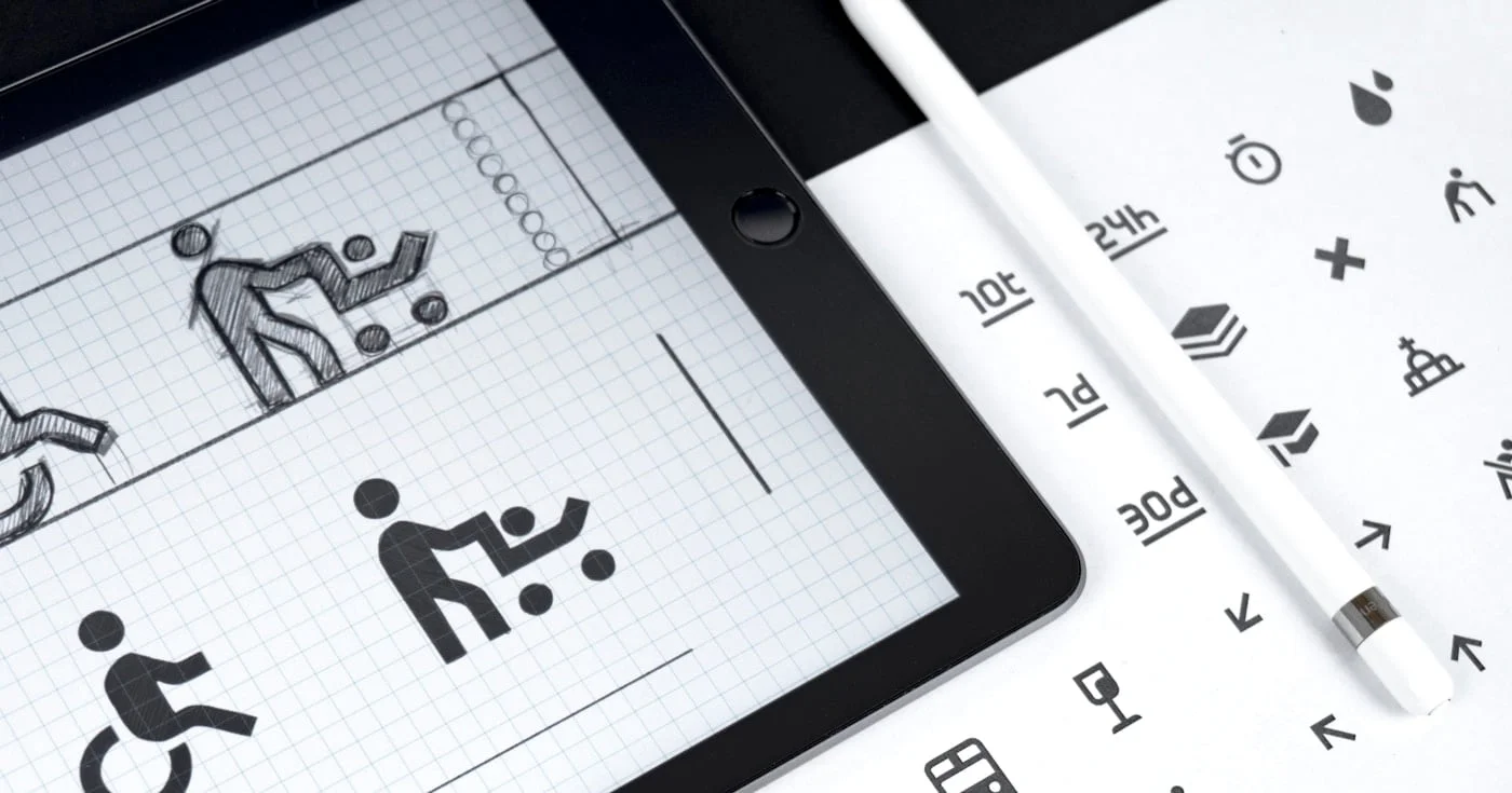
An ARIA label names a control with no visible text. When to use aria-label, when native HTML wins, and the misuse that hides the words on your button.

A complete guide to writing a web design proposal that wins clients. Covers the 8-section structure, real $4k–$15k pricing breakdowns, the two-option strategy,
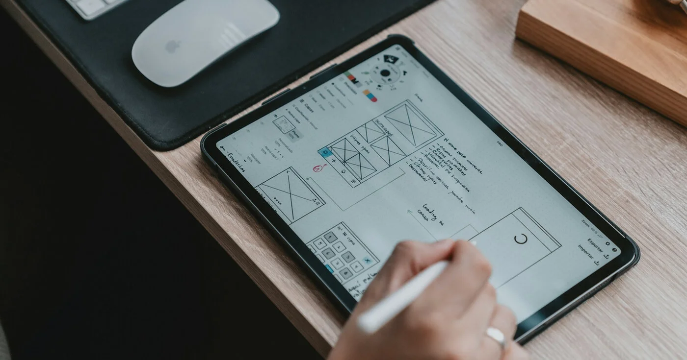
Master self-serve SaaS UX: Build seamless journeys from landing page demos to smart onboarding and advanced learning paths. Reduce friction and boost activation

