
Multi-Brand Design Systems: Tokens, Tenants, and Themes
Multi-brand design systems explained: how tokens let one codebase serve many brands, how they differ from multi-tenant and whitelabel, and the Figma setup.
Updated 11 min read

Multi-brand design systems explained: how tokens let one codebase serve many brands, how they differ from multi-tenant and whitelabel, and the Figma setup.
A multi-brand design system is a shared component library and token infrastructure designed to serve multiple distinct brand identities from a single codebase.
KAYAK runs one design system across seven travel brands, BT Group's Loop serves BT, EE and Plusnet, and Harry's built the Forge for Harry's and Flamingo. Each pairs one library with a theming layer that swaps visual identity while keeping shared interaction logic, accessibility, and structure. Past a couple of brands, one design system per brand stops being viable.
Below, you'll see how multi-brand systems differ from multi-tenant and whitelabel setups, how three-tier tokens work in production, and what Figma's newer features change.
A multi-brand design system is a set of guidelines, components, and token infrastructure that enables consistent, distinctive UI across multiple brand identities from a shared codebase. Instead of rebuilding UI components per brand, the system uses a theming layer (design tokens) to swap colors, typography, spacing, and visual style while component logic stays identical.
The efficiency comes from what doesn't change: button behavior, form validation, modal accessibility, and component structure are universal. What changes is purely visual.
Harry's runs this model as the Forge: a centralized resource that helps each brand, starting with Harry's and Flamingo, build its own design system. Brands can customize component layouts as well as styles.
BMW Group does the same across BMW, MINI, and BMW Motorrad with the Neo Design System. SAP Fiori is the design system for all SAP products.
The system handles what's universal. Brand tokens handle what's distinctive. The token/component separation is the architectural insight the whole model rests on.
Design tokens are named key-value pairs for color, spacing, typography, border radii, elevation, and animation. For multi-brand work, practitioners most often recommend three tiers.
Global / Primitive tokens hold raw values. --blue-500: #3B82F6, --spacing-4: 16px. No brand meaning yet.
Semantic / Alias tokens assign purpose. --color-primary: var(--blue-500) for Brand A; --color-primary: var(--gold-500) for Brand B. Same role, different brand value: the semantic layer is where brand identity lives.
Component tokens consume semantics. button-primary { background: var(--color-primary) }. Components never know which brand they're rendering for.
"The way you have set up your tokens with hex values as semantics will become incredibly difficult to update and maintain over time. For brands a three tier token systems is the most scalable."
u/requiem_for_a_Skream in r/DesignSystems
"If you are using a multibrand design system, I strongly recommend to use a three tiered approach to your design token architecture. This is using a brand collection, an alias collection, and also a map collection."
UI Collective, Multi-Brand Design System and Figma Variable Setup tutorial
Larger systems often add context on top: dark mode, high contrast, RTL/LTR directionality, and locale-specific typography.
Four implementation patterns show up in practice, and the choice shapes everything downstream.
Build-time (SASS compilation): Each brand gets a separate compiled stylesheet. No runtime overhead, no flash of unstyled content. The trade-off: dynamic brand switching requires a page reload, so this pattern suits static portfolios where tenants don't switch brands mid-session.
// tokens/_brand-a.scss
$color-primary: #e63946;

// main.scss
@use 'tokens/brand-a';
body { background-color: brand-a.$color-primary; }
Runtime (CSS custom properties): Tokens defined as CSS variables, overridden at :root or a scoped container. Theme switching via JavaScript class toggle, no page reload required. Standard for SaaS whitelabeling where tenants configure their brand in a settings dashboard.
The FOUC risk: if the theme class is applied after first paint rather than server-side, users briefly see the default brand styles.
Server-driven bootstrap: Engineering11's documented pattern follows three steps: ship a static default theme, fetch the tenant's bootstrap.json from a CDN at startup, then apply tenant overrides. On the web, those land as CSS custom properties on document.documentElement; the Flutter version maps 23 server color fields. No rebuild is required to add or rebrand a tenant.
The open source Stride DS exposes a TypeScript registerDynamicBrand() function for the same approach.
Agency snapshot fork: The master file is duplicated per client project, themed, then disconnected from the original. Zero live-sync overhead. Limitations: improvements require manual back-ports, and naming-convention drift breaks future master upgrades.
Use it for agencies where clients own their output and expect a stable baseline.
Figma variable modes are the intuitive first choice for multi-brand systems. Practitioners warn they stop scaling beyond a handful of brands.
"I do not recommend using modes to manage brands unless you have 4 or fewer brands. It gets super complicated and the files gets clunky"
u/Fast_Lifeguard_4330 in r/DesignSystems
The problem is multiplication: brand × light/dark × contrast all compete for the same mode slots. Figma raised the mode cap to 10 on Professional and 20 on Organization at Schema 2025, which helps, but brands still share an axis with themes.
Figma announced extended collections at Schema 2025 (October 28, 2025), with availability set for November 2025. A parent collection is extended once per brand; each extension inherits updates to any variable it has not explicitly overridden. Brand becomes its own dimension instead of another mode.
Extensions can live locally in the parent file or be published and subscribed to from a library. The feature is limited to Enterprise, Education (K-12) and Government plans.
Multi-brand, multi-tenant, and whitelabel often get conflated, including in community help threads. They're related but architecturally different.
Multi-brand (internal portfolio): One organization owns all brands and controls every brand identity and deployment context. Harry's/Flamingo, BMW/MINI/BMW Motorrad, and BT/EE/Plusnet are examples. The primary governance challenge: coordinating brand teams with separate roadmap priorities.
Multi-tenant (SaaS architecture): One software platform serves multiple client organizations, each with their own data isolation and branding; the platform operator doesn't control the tenant's brand. Mind Group Technologies reports running a white-labeled delivery platform for 30+ brands from a single codebase, with shared-database row-level security for tenant isolation. Primary governance challenge: enabling tenant customization without breaking platform coherence.
Whitelabel (partner-facing distribution): A design system distributed to external partners who rebrand it as their own. UHC/Optum's Abyss system lets consuming teams apply their own themes and own their token sets without depending on the core DS team. Primary governance challenge: maintaining a stable, versioned token API surface that partners can build on without constant dependency on the core team.
Pattern | Who Controls Brand | Primary Technical Need | Real Example |
|---|---|---|---|
Multi-brand | Internal brand teams | Token governance model | Harry's (The Forge), BMW Group |
Multi-tenant | Client organizations | Runtime theme injection per tenant | Mind Group (30+ brands), Engineering11 |
Whitelabel | External partners | Versioned token API surface | UHC/Optum Abyss, KAYAK hotel white-label |
The patterns overlap: a SaaS product can be both multi-tenant and whitelabeled. The distinctions still matter architecturally: each pattern has different governance requirements, different failure modes, and different tooling choices.
A bug fixed once propagates to all brands automatically. Roberto Moreno Celta described the shift: three brands in three codebases meant every bug fix was applied three times, until two weeks of rebuilding produced one themeable codebase with three themes. That is the financial case: every new brand inherits every fix already made to the shared foundation.
New brands or white-label clients launch by creating a new theme file, not rebuilding UI components. kickstartDS says its demo design system can take on a new look and feel in 30 minutes. One designer's case study reports a unified system built in 1.5 months for eight VF Emerging Brands. zeroheight reports that Decathlon rolled out its design system to 17 products across 19 countries in 4 months.
The system enforces accessibility standards and interaction patterns while each brand retains its distinctive visual identity. Alkistis Mavroeidi from KAYAK frames it precisely: "Consistency allows for differentiation." Design principles are the non-negotiable core, brand tokens the variable layer, and KAYAK runs this model across seven travel brands and 60+ markets with a lean team of 30+ designers.
Object Edge's case study for a multi-brand women's apparel retailer says the shared system enabled parallel design and development work across brands and is expected to lower the total cost of ownership on design-led initiatives. Removing duplicate component libraries is the obvious saving. Shared bug fixes, accessibility audits, and performance work keep adding to it.
For SaaS businesses, a whitelabel-capable design system changes the go-to-market model. As Mind Group puts it, instead of acquiring end users one by one, you acquire business clients who bring their entire user base. Fortune Business Insights valued the SaaS market at $315.68 billion in 2025.
"But marketing teams, sales decks, and regional offices don't touch Figma. They work in Canva, Google Slides, and random local tools."
u/SimonBuildsStuff in r/DesignSystems
Zalando's 16-person design system team told Config 2024 that theming quickly raised governance questions (who gets a theme, and who decides), and listed resilience through governance and principles as one of its three key learnings. In our reading, multi-brand systems face three governance gaps: in-system drift (fixed by token architecture and linting), out-of-system drift in tools like Canva, and cross-brand divergence (needs federated contribution rules).
Skipping the primitive layer (hardcoding hex values directly into semantic token layers) creates expensive refactors when the first rebrand arrives. The pattern seems harmless in a single-brand system, but the moment a second brand enters the picture, every hardcoded semantic value needs re-evaluation. The pain compounds with each additional brand.
A common story: a team ships a system for one brand, gets a second brand request, and discovers the token architecture wasn't built for it. Adding the primitive layer early is cheaper than retrofitting it later.
CSS custom properties are the standard for multi-tenant theming, but FOUC (flash of unstyled content) is the typical failure mode. If the theme class lands after first paint, users briefly see the wrong brand. The fix is to inject the theme class server-side before first paint; the Engineering11 server-driven bootstrap pattern is one documented way to do it.
Teams that built their Figma files around brand modes before extended collections arrived now face a migration decision. Figma's migration workflow has you export and delete each brand mode, create an extended collection per brand, import the modes back, then publish. Accepting that library update removes previously set variable modes from designs, so they must be reapplied during a quieter period.
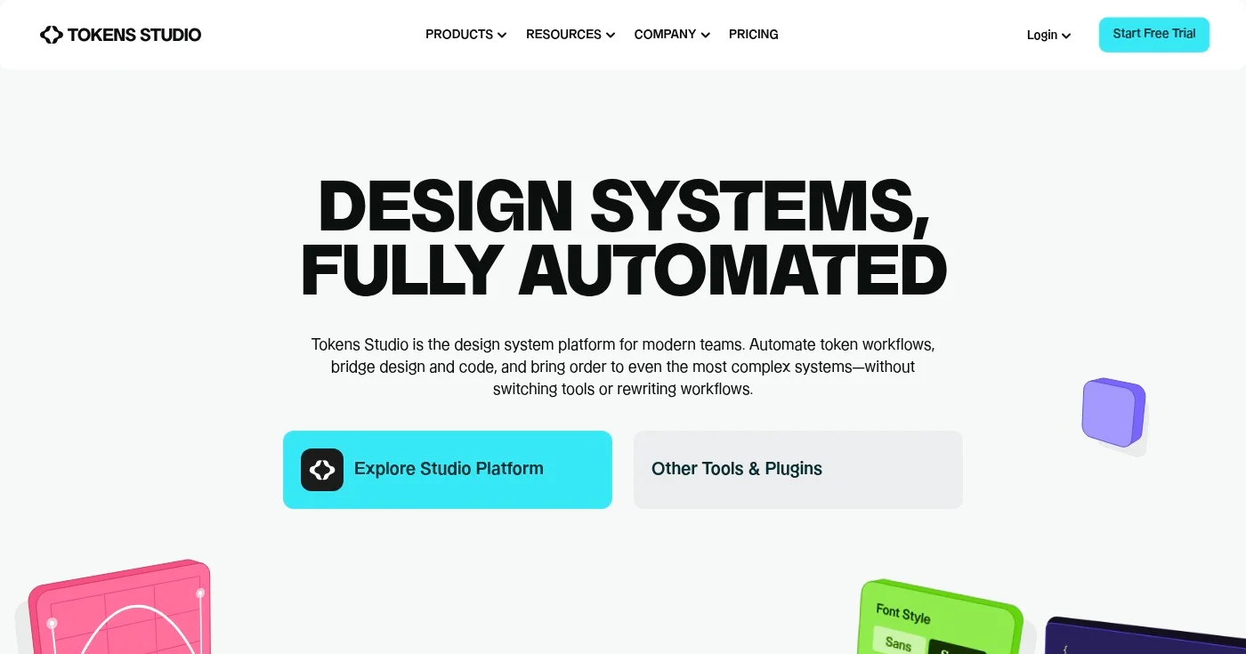
Tool | Role | Cost |
|---|---|---|
Token management in Figma, Git sync, DTCG reference implementation | Free; Team €39/mo billed annually; Organization €499/mo | |
Exports tokens to iOS, Android, CSS, JS and more | Free (open source, Apache 2.0) | |
Vendor-neutral format for sharing tokens across tools | N/A (specification) | |
DS documentation + token automation | Free Starter (3 editors); Pro $399/mo; Enterprise custom | |
DS documentation + governance | Free; Starter $49 per editor/mo; Enterprise custom | |
Open-source whitelabel DS framework | Free / commercial support | |
Storybook addon-themes | Switch component previews between themes | Free |
The Design Tokens Community Group announced its stable spec (2025.10) on October 28, 2025, the same day Figma promised native import and export aligned to it for November. The announcement lists Style Dictionary, Tokens Studio and Terrazzo as reference implementations and calls out theming and multi-brand support. As a DTCG co-chair put it on stage at Schema 2025: "We shouldn't still be copy pasting values across our design tools."

shadcn/ui copies component source into your repo instead of installing a package. How it works now: Base UI, eight styles, theme tokens, Figma kits, vs MUI.

Compare the 12 best AI avatar generators for 2026: HeyGen, Synthesia, D-ID, Colossyan, and 8 more ranked by use case, real free tier limits, and hidden costs.
You can add motion to your interface for free with 10 open source animated icon libraries, led by lucide-animated at 8,170 GitHub stars and 350+ icons.

