
Framer Motion: Layout, Exits, and When CSS Wins
Framer Motion is the MIT React animation library, not the Framer canvas. Primitives, layoutId, LazyMotion sizes, and why reducedMotion defaults to never.
Updated 12 min read

Framer Motion is the MIT React animation library, not the Framer canvas. Primitives, layoutId, LazyMotion sizes, and why reducedMotion defaults to never.
Framer Motion is an MIT animation library for React, JavaScript, and Vue. It rebranded to Motion in November 2024 and still ships as framer-motion v13.2.0. This page is that library, not Framer the canvas.
Head results mix docs, marketplace components, and Sites help. Production work is primitives, layout and exits, the kilobyte table, and a reduced-motion default that stays off unless you opt in.
motion and import from motion/react. Framer code components still import framer-motion.motion is about 34kb. m plus LazyMotion starts near 4.6kb. Decorative fades belong in CSS.layout / layoutId animate size and position after a React render. Pair exits with AnimatePresence popLayout.reducedMotion on MotionConfig defaults to "never". Opt in "user" or call useReducedMotion().Framer Motion is a declarative animation API. You put animate, variants, layout, and gesture props on a motion component. Styling stays CSS or Tailwind.
Physical props such as x and scale default to a spring. Visual props such as opacity default to a tween.
Matt Perry built Popmotion in 2014. Framer acquired that work around 2018. After six years as Framer Motion inside Framer, the library spun out as independent Motion in Amsterdam in November 2024, with Framer as first sponsor.
The npm name did not die. Sibling package motion is also 13.2.0 and depends on framer-motion. GitHub lives at motiondivision/motion (last commit 2 September 2026).
Ignore the similarly named GitHub fork that still ranks on the head query.
Three other products collide on the same words:
On r/reactjs, the recurring mix-up is that the "free version is super limited." That complaint describes Motion+ or Sites plans, not the MIT package.
"Can't say that it's super limited, very good library and makes some complex stuff very easy to do."
(u/svekl in r/reactjs, December 2025)
This is a web library. Moti and Legend-Motion on the same SERP are React Native.
CSS closed a lot of the old gap. Perry's own magazine essay (29 May 2024, updated 12 November 2024) lists @starting-style, independent transforms, linear() springs, height: auto / calc-size, and View Transitions as native now.
The library still earns its keep on jobs CSS does not finish cleanly: unmount exits, interruptible layout, gestures, stagger, and springs you can cut mid-flight. That is the design engineering split.
npm v13.2.0 shipped 2 September 2026. 13.0.0 (5 August 2026) dropped optional @emotion/is-prop-valid. 13.1.x added Reorder RTL and React 19 strict-mode AnimatePresence fixes.
Teams now start in CSS, then reach for Motion when React lifecycle is the actual problem.
You declare animation as props on a DOM node. First-party docs say motion components bypass React's render cycle and update through the browser animation pipeline. Treat that as a vendor description, not a measured benchmark.
Install for a new React app:
npm install motionimport { motion } from "motion/react"
export function Box() {
return (
<motion.div
animate={{ x: 100 }}
transition={{ type: "spring" }}
/>
)
}Upgrade path: uninstall framer-motion, install motion, swap the import. Framer overrides still import "framer-motion".
Keep both package names. Do not tell a Sites engineer the old package is dead.
motion.div is an animated HTML node. animate is the target. initial is the start.
variants name those states so a parent can orchestrate children without threading values by hand.
const list = {
  hidden: { opacity: 0 },
  show: {
    opacity: 1,
    transition: { staggerChildren: 0.08 },
  },
}

export function List({ children }) {
  return (
    <motion.ul variants={list} initial="hidden" animate="show">
      {children}
    </motion.ul>
  )
}
Gesture props sit on the same node: whileHover, whileTap, whileInView, drag. For scroll-in, set viewport={{ once: true }} so the animation does not re-fire every time the block re-enters.
Animate transform and opacity. width, height, top, left, and margin force layout.
"Before you pick a winner by library, check WHAT property you're animating, that matters way more than GSAP vs anime on mobile."
(u/krunal_builds in r/webdev, July 2026)
Emil Kowalski puts the same craft point on X: easing, timing, and the property you chose, not the library logo.
Most animations don’t feel off because of the code. They feel off because of the decisions behind them: the easing, the timing, or the properties you chose to animate. My course teaches you how to make those decisions. You can enroll for the next 10 days. Here’s what’s inside: https://t.co/eiGYbyiS9C
If a 1px snap appears at the end of a transform, Kowalski (October 2025) reaches for will-change: transform so the GPU owns the composite.
Springs are the default on x, y, scale, rotate. Tweens are the default on opacity and color. That split is why a fade can look fine while a card still bounces: you inherited a spring you did not pick.
Gestures (drag, pan, hover, tap) are why product UI stays in Motion when CSS would do the fade, and why domMax exists in the LazyMotion table below. Do not load pan and drag for a landing-page opacity.
r/reactjs defaults to CSS, then Motion for React-integrated cases:
"Motion has nice react integration, that's what I'm using in the few places I need it. Most of the time I don't need animations and often when I do, a small css animation is enough."
(u/Wirde in r/reactjs, April 2026)
Magic UI and Aceternity consume Motion. This guide is not a component gallery.
A layout animation runs because React committed a new size or position, not because you put pixels in animate. Official layout docs implement that with a CSS transform (FLIP).
Values: true, "position", "size". Default is false.
Changes belong on style or className. Do not drive layout from animate or whileHover.
<motion.div layout className={open ? "expanded" : "collapsed"} />Perry's Vercel talk is the two-prop version: a motion component plus layout. That is the whole API for "same element, new position."
layoutId is a shared-element / crossfade if both instances remain in the tree. Pair it with AnimatePresence if the origin unmounts, so the node can animate back.
IDs are global. Two tab underlines with the same string will fight. Namespace them with <LayoutGroup id={id}>.
layoutDependency skips measuring on every commit when you already know what changed. Use it on hot lists.
View Transitions complement layout animations. Perry on Syntax (43:35): they are uninterruptible, full-screen by default, and a poor fit for micro-interactions.
Layout works on the DOM and can be interrupted. Official layout docs also warn about unique IDs, snapshot jumps, and mixed transitions that leave children behind.
Layout animations cost around 12kb, then stay cheap to retune. Projection is still main-thread.
Nested projecting children can look frozen during list-to-detail, especially while React is mounting. That failure mode is why "shared element on the web" ships as two static screens.
Jobs that fit: list-to-detail, shuffle on flex/grid, height: auto accordion, tab underlines, morphing dialogs. Page-length cinematic scroll is GSAP plus ScrollTrigger, or a View Transition, not layout.
CSS still cannot unmount a node and play its exit as cleanly as React can. AnimatePresence unlocks exit. Direct children need a unique key.
Live mode values from types.ts: "sync" | "popLayout" | "wait". Default is "sync". wait supports only one child at a time.
popLayout pops exiting elements so siblings take the new layout immediately. Pair popLayout with layout. Mix in LayoutGroup so siblings outside AnimatePresence still know when to animate.
import { AnimatePresence, motion } from "motion/react"

export function Card({ open, children }) {
  return (
    <AnimatePresence mode="popLayout">
      {open && (
        <motion.div key="card" layout exit={{ opacity: 0 }}>
          {children}
        </motion.div>
      )}
    </AnimatePresence>
  )
}
Perry's modes tutorial (24 September 2025) is the worked reference.
The scare number is Bundlephobia's 50kb-plus. Official reduce-bundle-size docs call that misleading if you never import full motion.
Full motion is about 34kb and is not tree-shakeable. Import it for six fades and you paid for layout, drag, and pan you do not use.
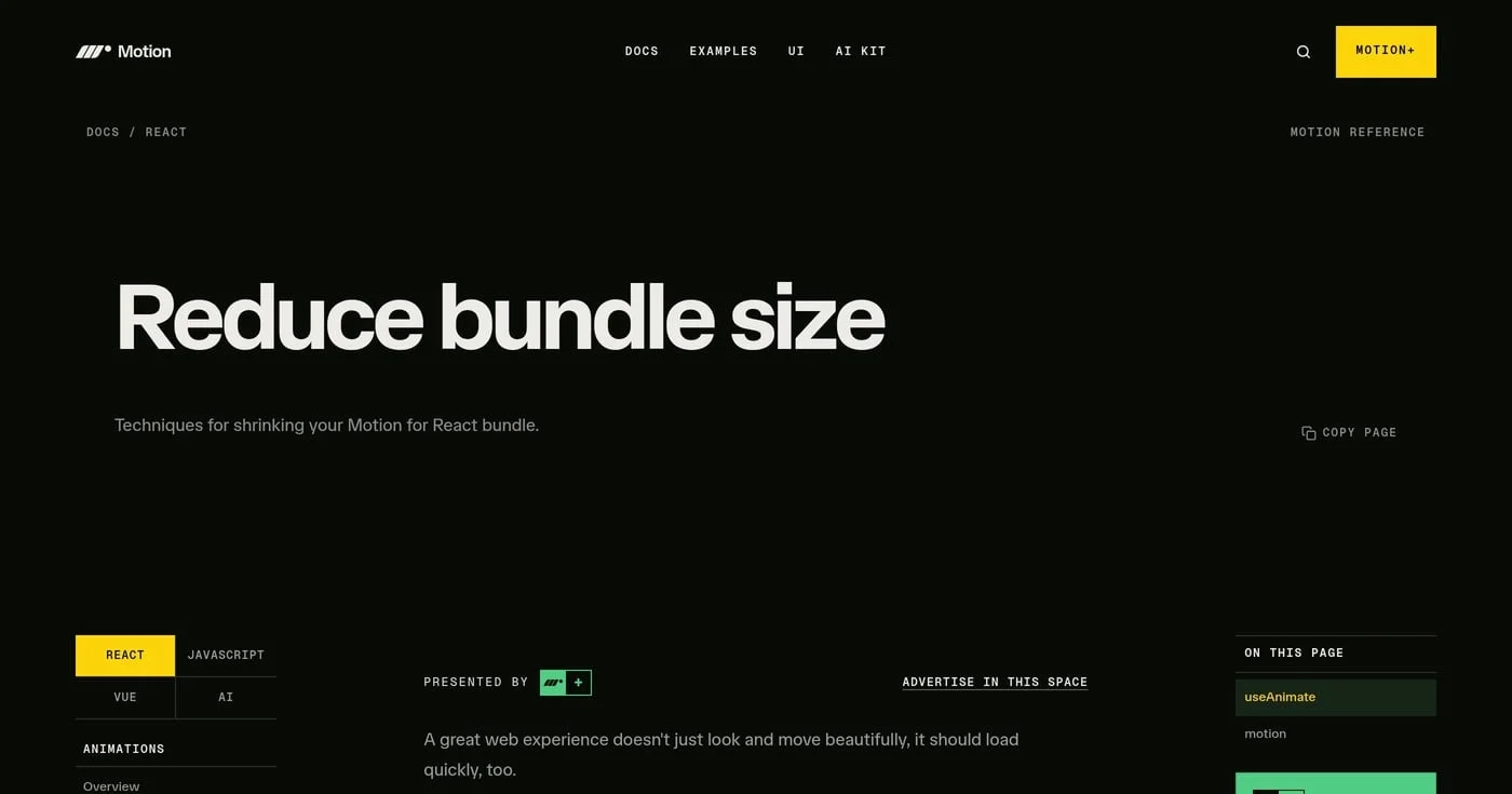
Sizes below are first-party, from the reduce-bundle-size page. useAnimate mini is 2.3kb in the docs, not the older 2.5kb tweet.
Import | What you get | Size |
|---|---|---|
| WAAPI-only | 2.3kb |
| JS plus WAAPI | 17kb |
| Full component | 34kb |
| Initial | ~4.6kb |
| animate, variants, exit, tap, hover, focus | +15kb |
| pan, drag, layout | +25kb |
import { LazyMotion, m, domAnimation } from "motion/react"

export function App({ children }) {
  return (
    <LazyMotion features={domAnimation} strict>
      {children}
    </LazyMotion>
  )
}
strict (default false) throws if a full motion component renders inside the tree and undoes the savings. Path: CSS for decorative motion; LazyMotion domAnimation if you need the API; domMax only for layout and drag.
Keep motion at leaves, not on a Next App Router page shell. A 'use client' tax on the layout file ships the animation runtime to every child whether they animate or not.
Do not print npm weekly downloads as "users." The counters are CI-noisy, and first-party marketing figures conflict.
Perry's magazine verdict: start with CSS for enter and height: auto. Keep Motion for exit, layout, interruptible springs, gestures, stagger, and scroll-triggered sequences that still need the JS API.
View Transitions handle shared-element page snapshots with view-transition-name. That is a different primitive from layoutId.
Use VT for route-level snapshots. Use layout for interruptible in-page UI.
Native CSS is also the web accessibility path for people who never load your JS. If the motion is decorative, the cheaper stack is the honest one.
r/reactjs says the same thing without a kilobyte table:
"I'd strongly recommend sticking to CSS animations. Animation libraries are heavy and usually the fancy animations just end up annoying actual users."
(u/yksvaan in r/reactjs, December 2025)
Two independent write-ups actually removed the package for decorative marketing sites. Copy the decision. Hedge the percentages.
Mintec (28 July 2026) replaced the library plus Barba plus ScrollTrigger (112 KB minified JS) with View Transitions, Speculation Rules, and CSS animation-timeline: scroll().
The agency write-up claims 85 KB fewer JS dependencies and 18% INP. A related stack line puts layout plus page transitions at 52 KB. Treat those as the author's measurements, not a lab study.
sumorai (9 April 2026) had six fade, nav, and hover animations. The library was the 40KB+ largest dependency.
CSS plus IntersectionObserver cut the bundle 27%. Their phrase: a sledgehammer for a finishing nail.
Neither case is a product-UI accordion with interruptible layout. Keep Motion for a filter-chip layout, a dialog morph, or an exit that must finish before the next route. Drop it when the file is a brochure.
MotionConfig takes reducedMotion: "user" | "always" | "never". The default is "never". Until you change it, OS "reduce motion" does nothing to your springs.
When reduced motion is on, transform and layout animations disable. opacity and backgroundColor persist. That is the intended split: keep the fade, kill the bounce.
import { MotionConfig } from "motion/react"

export function App({ children }) {
  return (
    <MotionConfig reducedMotion="user">
      {children}
    </MotionConfig>
  )
}
useReducedMotion() returns a boolean and re-renders when the OS setting changes. Use it when a variant itself should swap, not only when the engine should skip transforms.
import { motion, useReducedMotion } from "motion/react"

export function Card() {
  const shouldReduce = useReducedMotion()
  return (
    <motion.div
      animate={
        shouldReduce ? { opacity: 1 } : { scale: 1, opacity: 1 }
      }
    />
  )
}
Some official a11y snippets still import from "framer-motion". Use the hook, not the stale import path.
Unbranded prefers-reduced-motion on MDN is reduce / no-preference. Wire CSS for the no-JS path, then the hook for JS variants.
This is not a WCAG compliance guide. WCAG 2.3.3 (motion from interactions) and 2.2.2 (pause, stop, hide) are the one-line a11y note: if you cannot reduce it, give a pause.
Reddit already names the hook as kit-quality polish. It does not mention the "never" default.
"One thing worth adding if you haven't already: prefers-reduced-motion support. Framer Motion makes it easy with useReducedMotion(): you can swap out the spring/bounce variants for instant or simple fade transitions."
(u/ruibranco in r/reactjs, February 2026)
LottieFiles on LinkedIn (September 2026) makes the vestibular point in company voice: not all motion feels good to everyone.
Do not copy Framer Site Settings → Accessibility here. Those toggles belong to the canvas, not this library.
Pick the job, not a winner. Comparison posts still say "React-only." That is false.
Motion covers JavaScript and Vue via motion-v. Perry told Syntax the Vue port never really took off unless sponsors pull it. It still exists.
Tool | Wins at | Skip when |
|---|---|---|
Declarative React UI, | Decorative fades, particle fields, cinematic scroll | |
Timelines, ScrollTrigger, canvas / WebGL, scrollytelling | Simple enter/exit that CSS or Motion already covers | |
CSS / View Transitions | Enter, | Interruptible micro-interactions, React unmount exits |
React Spring | Physics-style React springs | Shared-element layout, presence |
Webflow acquired GSAP on 15 October 2024. In late April 2025, GSAP became 100% free, including previously paid Club plugins, and the standard license expanded to commercial use (v3.13). The original team is full-time at Webflow.
Motion's live GSAP comparison still talks closed-source, competitor restriction, and discretionary termination. Do not reprint that as current.
Do not reprint 2.5× or 6× speed claims either. Those are first-party marketing, and the license under them moved.
LinkedIn production posts in 2026 name useGSAP plus ScrollTrigger plus SplitText on award sites. That is the cinematic end of the spectrum. Product UI (tabs, toasts, dialogs, list-to-detail) is still Motion's job, including next to a React kit such as Untitled UI React.
Particle-like UIs (bubble walls, dozens of independent nodes) are the wrong tool for layout projection. If the node count looks like a canvas demo, use canvas.
motion for FadesSix opacity tweens do not need 34kb. Use CSS or useAnimate mini (2.3kb). If you need the component API, wrap m in LazyMotion with strict.
Width, height, and left reflow. Mobile jank that gets blamed on GSAP vs Motion vs Anime is the animated property.
Animate x, y, scale, opacity. Let layout handle size changes after React commits.
reducedMotion at "never"The engine will not read the OS setting for you. Set MotionConfig reducedMotion="user" at the root, or branch on useReducedMotion().
Transform and layout should die. Opacity can stay.
layoutId as LocalIDs are global. Two features that both use layoutId="underline" will crossfade into each other. Wrap each feature in <LayoutGroup id="tabs"> / <LayoutGroup id="nav">.
If you build on the canvas, do not npm-install Motion. If someone says the free version is limited, they are describing Motion+ or a Sites plan. The library is MIT.
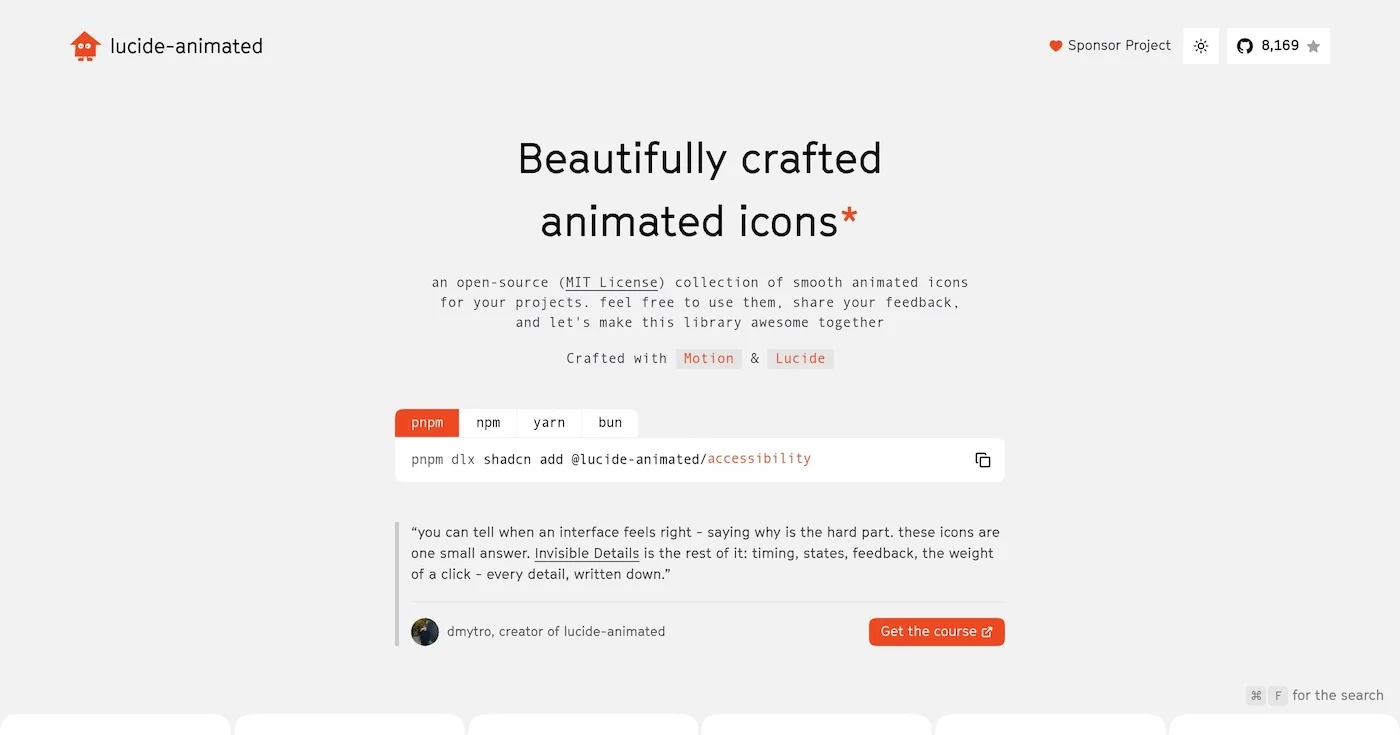
You can add motion to your interface for free with 10 open source animated icon libraries, led by lucide-animated at 8,170 GitHub stars and 350+ icons.

A Lottie animation is a JSON description of a vector timeline, usually exported from After Effects.

Vibe coding is prompting an LLM until the software runs, accepting every diff, and skipping the code. Andrej Karpathy coined the phrase in February 2025.

