Master email design with this complete guide. Learn the key elements, best practices, layout principles, responsive techniques, accessibility, and the best tools designers use to build emails at scale.
Updated 13 min read
Email remains one of the highest-ROI marketing channels available. For every $1 spent, email marketing returns $36 on average. But that return depends heavily on design quality.
This guide covers everything you need to know about email design, from core elements and layout principles to responsive techniques, accessibility, and the tools designers use to build at scale.
Key Takeaways
Email design includes inbox-visible elements (sender, subject line, preheader) and body elements (header, images, CTAs, footer)
Accessibility and dark mode support are no longer optional: about 15% of users have a disability affecting how they interact with email
What Is Email Design?
Email design is the process of creating the visual structure and layout of an email marketing campaign. It covers graphic design choices (images, color schemes, typography), content structure (how information is organized), and technical implementation (HTML/CSS that renders correctly across clients).
Two emails can share the same colors, fonts, and logos, yet produce completely different experiences depending on how content is laid out and how the design functions across devices and email clients.
Why Email Design Matters in 2026
There are 4.6 billion email users worldwide, with 376.4 billion emails sent daily. The inbox is a crowded channel.
Good design determines whether your email gets read or deleted. Poorly formatted emails break on mobile, fail accessibility checks, or get flagged as spam before a subscriber ever sees them. A clean, well-structured design does more than look good: it guides readers toward action, reinforces brand trust, and works reliably across every email client.
For designers and developers, email design sits at the intersection of visual design, front-end constraints, and UX principles. It demands a different skill set from web design because email clients impose restrictions that browsers don't.
How Email Design Works: A Complete Framework
Email design starts before the reader opens the message, and it extends through every interaction inside the email body. Here's how the full framework breaks down.
Inbox-Visible Elements (Pre-Open)
The inbox is your first design surface. Three elements are visible before a subscriber opens your email:
Sender name sets immediate context. You can use your brand name ("Acme Co") or personalize it ("Sandra at Acme Co") to improve trust and open rates. Consistency matters: changing the sender name confuses subscribers.
Subject line is the primary open driver. Keep it concise, honest about what's inside, and relevant to the segment receiving it. Avoid generic phrases like "Important update" or subject lines that trigger spam filters.
Preheader text appears after the subject line in most email clients. This is your second chance to convince someone to open. Never waste it on "View this email in your browser." Write it as a natural extension of the subject line that adds context or creates a reason to open.
Core Email Body Structure
Once opened, the email body is structured around a consistent set of components:
Header sits at the top and carries your logo. It establishes brand identity immediately. Keep the header simple: one logo, consistent placement, no competing elements.
Hero section is the largest visual element and communicates the primary message. The hero image or banner should be sized correctly for email (600px wide on desktop) and include descriptive alt text in case images are blocked.
Body content organizes the information your reader needs. Short paragraphs, clear headings, and bullet points make the content scannable. Most readers spend only 10 seconds on a brand email, according to Litmus.
CTA buttons are the most conversion-critical element. Use a single primary CTA per email. Reserve your brightest, highest-contrast color for the button. Size it generously for tap targets on mobile (minimum 44x44px).
Footer closes the email with necessary legal content: physical address, unsubscribe link, social media links, and any required disclosures. A clean footer protects deliverability and complies with CAN-SPAM and GDPR requirements.
The Technical Layer
Below the visual design sits the technical implementation: HTML tables (not divs) for layout compatibility with Outlook, inline CSS because email clients strip <style> blocks, media queries for responsive behavior, and fallback fonts for clients that don't load web fonts.
Understanding these constraints shapes every design decision. What looks perfect in Figma may break in Outlook if the underlying code doesn't account for its rendering quirks.
Responsive Email Design
81% of users prefer opening email on smartphones, and 41% of all opens happen on mobile. A non-responsive email doesn't just look bad: it loses readers and conversions.
Standard Email Dimensions
Email width standards are well-established: 600px on desktop, 320px on mobile. Emails designed outside these dimensions cause horizontal scrolling on mobile, which nearly all users abandon immediately.
Single-column layouts are the most reliable choice for mobile responsiveness. They stack cleanly, require no horizontal scrolling, and are easy to implement with CSS media queries.
CSS Media Queries for Email
Media queries let you define different styles for different screen sizes. A typical responsive email uses @media only screen and (max-width: 600px) to override desktop styles: increase font sizes, expand touch targets, stack multi-column sections, and hide decorative elements that don't work on small screens.
Mobile-First Design
Designing mobile-first means building your layout for the smallest screen first, then enhancing it for desktop. Since most of your audience is on mobile, this approach prioritizes the majority experience. Mobile-optimized emails generate 15% higher conversion rates compared to non-optimized ones.
Only 35% of email marketers currently use a mobile-first or mobile-responsive design process, which means a well-optimized mobile email still stands out.
Typography and Visual Hierarchy
Typography Best Practices
Body text needs to be readable at arm's length on a phone. The minimum is 14–16px with a line height of approximately 1.5. Headlines should create clear contrast with body text but don't need to be oversized: the goal is hierarchy, not decoration.
Use web-safe fonts for body text: Georgia, Helvetica, Arial, and Verdana render reliably across all clients. Custom web fonts can be used for headlines, but they require a fallback stack. When a custom font fails to load, the fallback renders instead. Without a proper fallback, the email may default to Times New Roman.
Keep the typeface count to two maximum per email. One for headlines, one for body text. More than that creates visual noise without adding value.
Building Visual Hierarchy
Visual hierarchy guides readers through content in a logical order. The most important element should be the largest. CTAs should use your highest-contrast color. White space creates breathing room and separates distinct sections.
A strong hierarchy means a subscriber can scan an email in seconds and understand its core message without reading every word. This is how most people actually read email.
Design Element
Purpose
Best Practice
Hero image / headline
Primary message
Largest element, above the fold
Section headings
Content navigation
Clear contrast with body text
CTA button
Primary action
Single per email, high contrast color
Body text
Supporting detail
14–16px, 1.5 line height
White space
Readability
Generous padding between sections
Footer
Legal / trust
Subdued styling, all required links
Dark Mode and Email Client Compatibility
Email Client Market Share
Designing for email means designing for three primary rendering environments. As of February 2026, Apple Mail holds a 45.51% share, Gmail sits at 23.54%, and Outlook at 5.67%. Together, they account for the dominant majority of all email opens.
Each client handles CSS differently. Apple Mail supports a wide range of modern CSS. Gmail supports more than it used to but still strips many <head> styles. Outlook uses Microsoft Word's rendering engine on Windows, which is notoriously restrictive and doesn't support flexbox, grid, or many modern CSS properties.
Designing for Dark Mode
Dark mode adoption has grown steadily. Litmus data shows 34% of users viewed emails in dark mode as of 2022, with the trend continuing upward. Apple Mail, Gmail, and Outlook each handle dark mode differently: some invert colors automatically, others respect media queries, and a few do both depending on user settings.
The safe approach is to design with both modes in mind. Use transparent PNGs for logos so they don't appear as white boxes against a dark background. Test your email with Gmail's forced dark mode, because it applies its own color logic regardless of your CSS. Use CSS @media (prefers-color-scheme: dark) queries to define explicit dark mode styles when clients support it.
Testing Across Clients
Before sending, test in at least the top three clients. Tools like Litmus and Email on Acid render previews across 70+ email clients so you can spot rendering issues before they reach subscribers.
Building an Email Design System
A modular design system is the most efficient way to produce consistent, on-brand emails at scale. Rather than designing every email from scratch, you create reusable components that can be mixed and matched.
What Goes in a Design System
The typical email design system hierarchy looks like this:
Content: text areas, images, data tables
Components: standalone elements like buttons, logos, icons that work anywhere
Regions: grouped content and components, usually organized in columns
Sections: full-width horizontal containers that stack between header and footer
Every promotional email, newsletter, and transactional email then shares the same building blocks, just assembled differently.
Design System Benefits
Brand consistency improves when all team members pull from the same component library. Production time drops because you're not rebuilding common patterns each campaign. A validated component works reliably everywhere it's used.
According to Email Love, teams without a design system regularly encounter problems like designers rebuilding existing components from forgotten Figma files and contractors using outdated brand colors. A documented system prevents all of it.
Figma for Email Design
Figma has become the dominant tool for email design systems. You can build component libraries, use auto-layout for responsive behavior, and hand off designs to developers. Figma-to-email code translation still requires manual work or a dedicated builder like Beefree or Stripo to export production-ready HTML.
Accessibility in Email Design
About 15% of people have a disability that affects how they use email, including visual impairments, motor disabilities, and cognitive differences. Accessible design serves this audience and tends to improve the experience for everyone else too.
"Accessibility is an investment in your ability to retain future subscribers at a higher rate." — Chad S. White, Head of Research at Oracle Digital Experience Agency
Core Accessibility Requirements
Every image needs alt text that describes what's shown. This serves both screen readers and email clients that block images by default. The alt text should describe the image content, not just repeat the surrounding text.
Links need to make sense without relying on color. A link that says "Click here" in blue doesn't communicate where "here" leads to a screen reader user. Use descriptive anchor text: "View your order" or "Read the guide."
Your HTML structure should use proper heading tags (H1, H2, H3) rather than just styling regular text to look bigger. Screen readers use heading hierarchy to navigate content, and correctly tagged headings also help email clients apply sensible default styling.
Minimum contrast ratio between text and background should meet WCAG AA standards: 4.5:1 for normal text, 3:1 for large text. Low contrast fails users reading in bright sunlight and those with low vision.
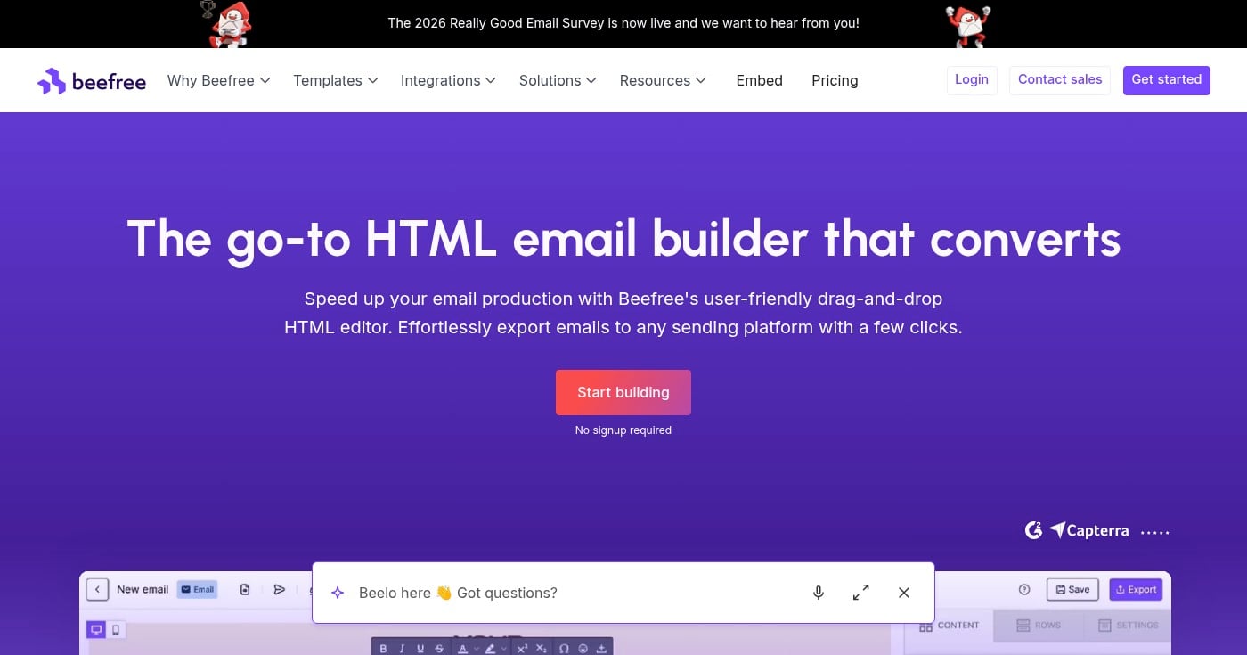
Beefree is a strong starting point for most designers. The free plan covers 6 exports per month, and the drag-and-drop interface handles responsive layouts without manual coding. Paid plans start at $25/mo with unlimited exports.
Beefree email builder homepage.
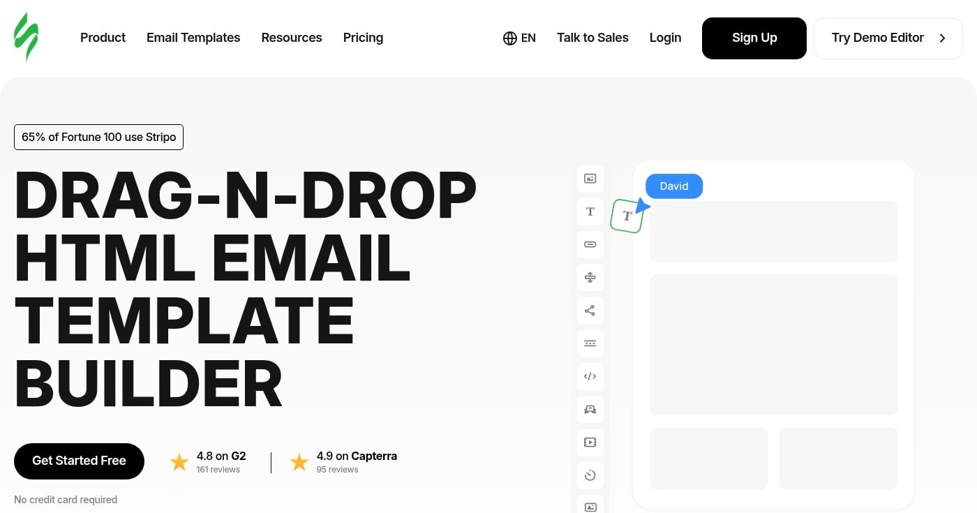
Stripo offers a free tier with 4 monthly exports and supports exporting directly to over 80 email service providers. It's built for teams that produce high email volume.
Stripo email template builder homepage.
Unlayer is designed for developers and SaaS teams that want to embed an email editor inside their product. It's priced accordingly, starting at $250/mo.
Common Email Design Mistakes to Avoid
Image-Only Emails
Using a single large image as your entire email body feels like a shortcut, but it creates three serious problems. Email clients that block images by default (a common corporate setting) render a blank email. Screen readers can't parse image content. And spam filters flag high image-to-text ratios. Maintain a roughly 70% text, 30% image ratio.
No Mobile Optimization
Sending emails with fixed-width multi-column layouts guarantees a broken experience for the 41% of readers on mobile. Single-column layouts and CSS media queries solve this. Test on at least one iOS and one Android device before sending.
Too Many CTAs
Multiple competing calls to action split the reader's attention and reduce conversions. Focus each email on one primary goal. If you need a secondary link, make it visually subordinate: smaller, less prominent, plain text rather than a button.
Custom Fonts Without Fallbacks
Custom web fonts look polished but fail silently when an email client doesn't support them. Without a specified fallback font, your carefully chosen typeface renders as Times New Roman or the client's default. Always specify a complete fallback stack: font-family: 'Custom Font', Georgia, serif.
Ignoring Dark Mode
With dark mode adoption growing steadily across clients, an email that looks great in light mode can become unreadable when colors invert. Logos with white backgrounds appear as white boxes. Light text on dark backgrounds becomes invisible when forced-light mode activates. Test your designs in both modes.
Wasting the Preheader
The preheader is prime conversion real estate. "View this email in your browser" is the most common text wasted on this space. Write preheader copy as a natural extension of your subject line: it should add context, create curiosity, or reinforce why this email is worth opening.
Email Design in Practice: Litmus Case Study
Litmus, one of the leading email marketing platforms, uses a modular email design system internally to produce its newsletter. Rather than rebuilding from scratch each send, the team works from a library of pre-tested content blocks: header, footer, article cards, event sections, and CTA modules.
The system allows their team to build new campaigns quickly while maintaining brand consistency. Hannah Tiner, their former Marketing UX Designer, describes capping newsletter content at three to five events per issue as a designed constraint, not a last-minute editorial call.
The modular approach reduced production time and eliminated brand drift: problems like inconsistent button colors or outdated fonts that plague teams without documented systems. For developers building email production tools, this case study illustrates the real-world value of scalable architecture over one-off customization.
Email design sits at the intersection of visual design, front-end constraints, and user experience. The fundamentals: responsive layout, visual hierarchy, brand consistency, accessible code, and client-tested rendering remain constant even as trends evolve.
Start by auditing your current email templates against the principles in this guide. Fix mobile responsiveness and accessibility first, since both have the highest impact on the widest audience. Then build toward a modular design system that scales your production without sacrificing consistency.
Visual identity is the complete set of visual elements that communicate a brand personality. This guide covers the recognition stack, 5-phase build process, dark mode adaptation, and design token integration for product designers.
A complete guide to design engineering in software: what the role is, core skills, tools, salary data, career paths, and how companies like Vercel structure their design engineering teams.