Design System
-
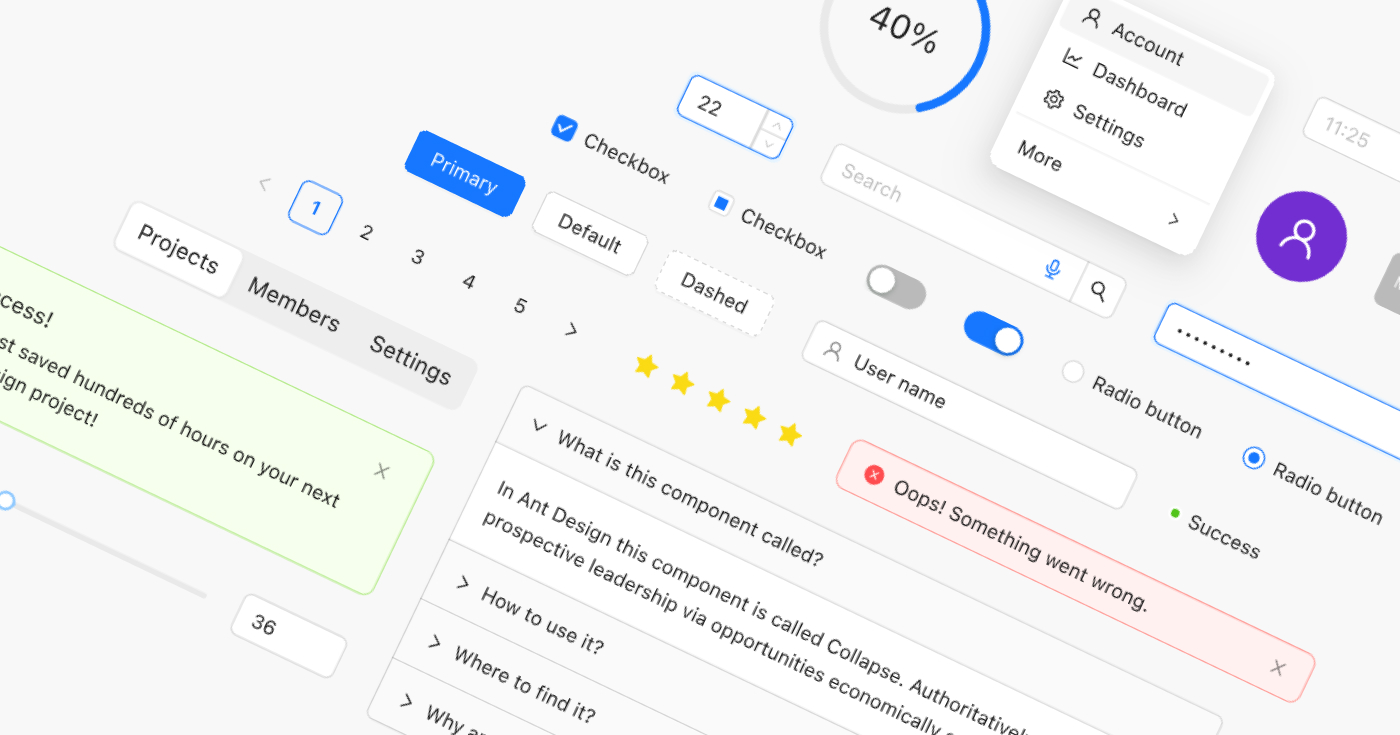
Ant for Figma: The Ultimate Design System UI Kit in 2025
If you want to design and ship Ant Design-based apps in record time, Ant for Figma is your new best friend. With 2,100+ components, auto-layout, and real React code export, this kit is the secret weapon for design teams at every scale.
-
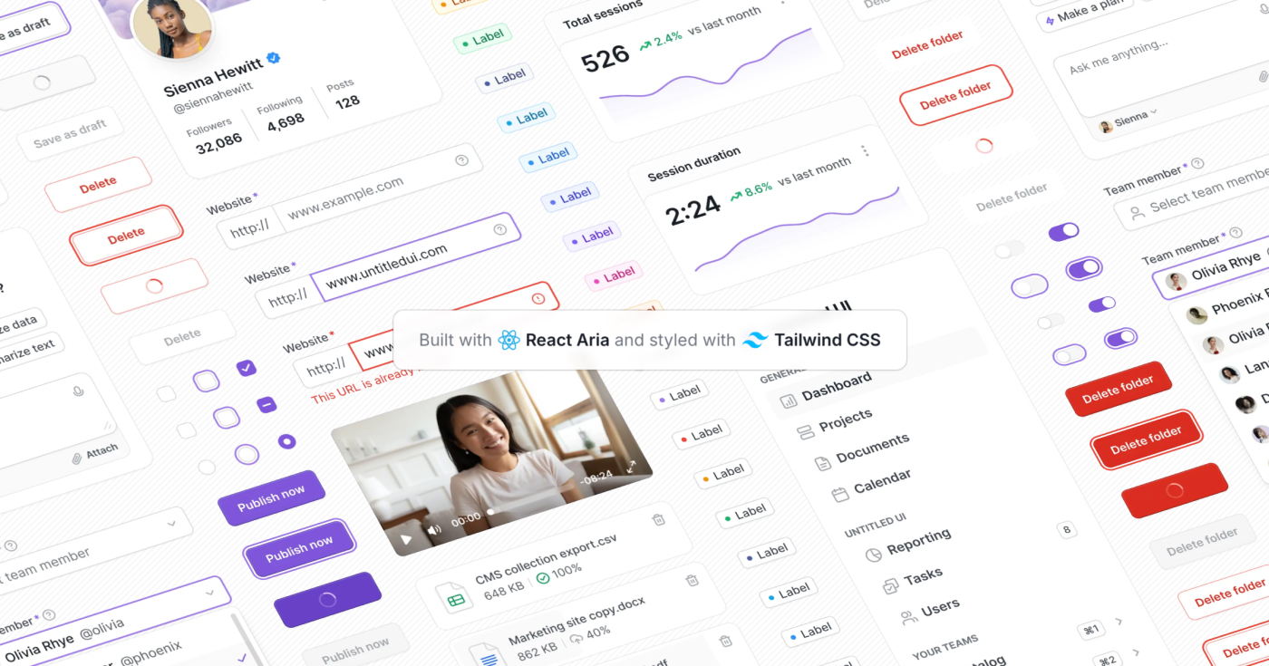
Untitled UI React: Open-Source Components for Modern Apps
Discover how Untitled UI React redefines developer workflows with 5,000+ production-ready components built on Tailwind CSS and React Aria.
-
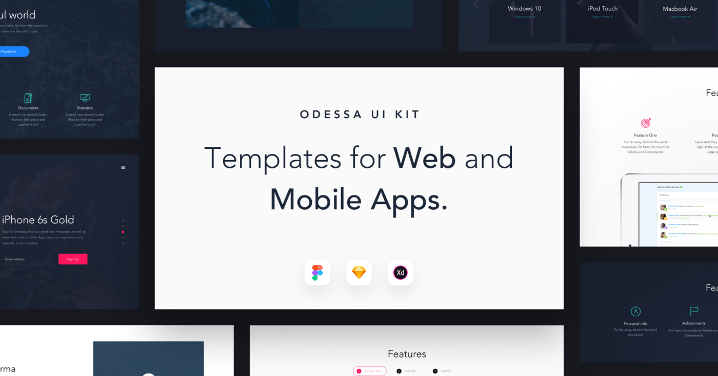
Odessa: XD Responsive UI Kit (Premium)
Odessa is a huge collection of responsive UI components & layouts for Adobe XD, Figma and Sketch.
-
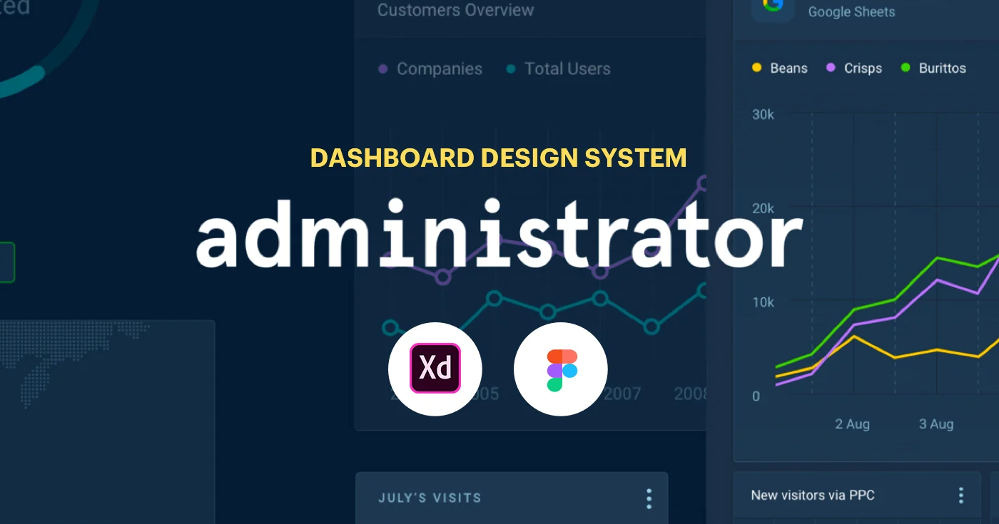
Administrator: Premium XD Dashboard UI Kit
Administrator is a complete dashboard & admin design system for Adobe XD and Figma.
-

Modular – Premium XD Design System
Modular is a customizable & adjustable design system and visual composer with a styleguide and 500+ ready-to-use components.
-
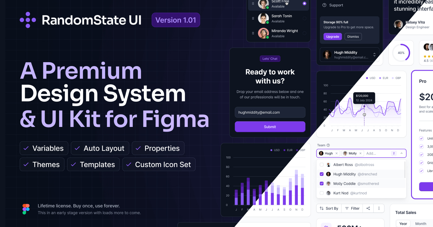
Random State UI Kit: Next-Gen Figma Design System
Random State UI kit is a high-quality, modular design system for Figma, crafted to help designers and teams move faster and build better products. With 2,100+ components, 160+ ready-made sections, and a growing icon set, it’s a future-proof toolkit for anyone looking to streamline their design process.
-
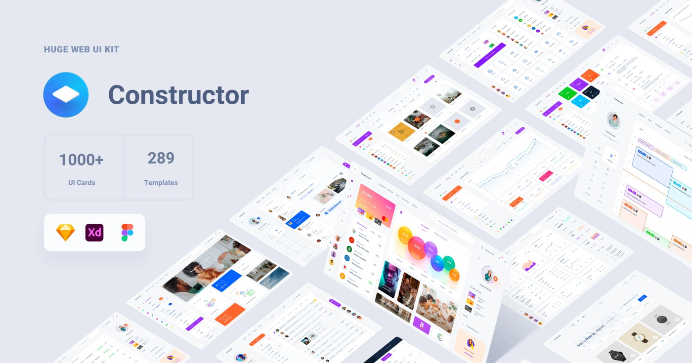
Constructor UI Kit: Multipurpose Premium Design System
Get the Constructor UI kit with 311 templates, 545 blocks, and over 1,000 UI cards across 22 categories. Compatible with XD, Figma, and Sketch.
-
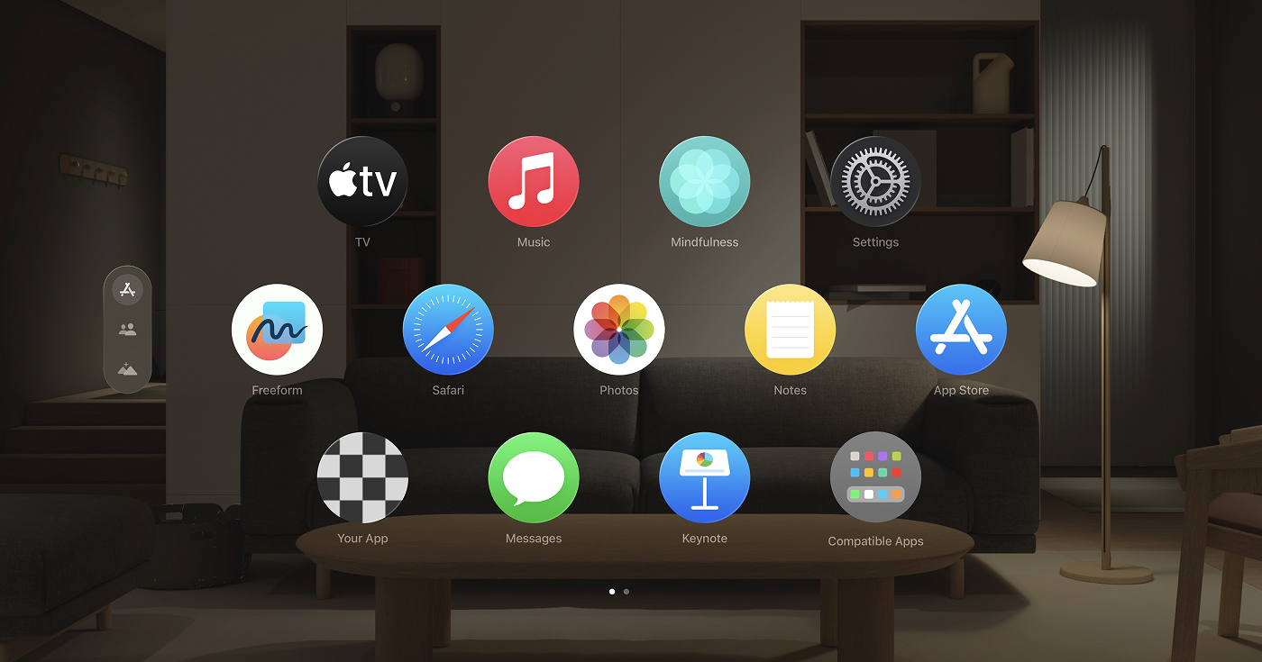
The Ultimate Guide to Official Apple Design Resources (2025)
Apple provides a comprehensive suite of design resources: templates, icon kits, fonts, bezels, and more, to help you build beautiful, consistent apps.
-

Apple Human Interface Guidelines (HIG)
If you’re designing for any Apple platform—iOS, macOS, watchOS, tvOS, or visionOS—the Apple Human Interface Guidelines (HIG) are your North Star.
-
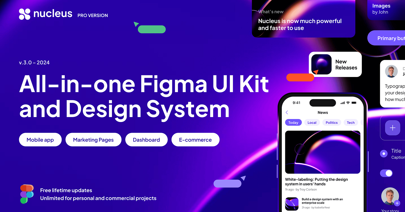
Nucleus UI PRO: The All-in-One Figma UI Kit
If you’re looking to speed up your design workflow in Figma, Nucleus UI PRO is a comprehensive toolkit that covers both mobile and web projects.